In case you haven’t already heard, Android P Developer Preview 1 is out now for Google Pixel devices. The last Nexus devices, 6P and 5X won’t be getting Android P updates and thus haven’t been included in the beta release either. While it marks the end of official support for the last Nexus devices, Android P brings in quite a few changes and features over Android Oreo. To give you an idea, Android P brings more visual changes in the first Developer preview over Oreo than Android Oreo did in all of its previews over Nougat. So it is definitely more exciting for those who like newer designs.
We’ve talked about a few new features when we shared the stock wallpapers from the Android P Developer Preview 1. let’s see if we can talk about them and something more in a bit more detail here.
Notch support & status bar
This is literally the first feature we knew Android P was going to have, thanks to leaks. It is now official, whether you like notches or not. Notches are here to stay apparently. The phones announced this year at the MWC have mostly had notches too apart from the thankful omission of Samsung’s and Sony’s flagships. If you’re an Android fan you’re probably screaming right now, but if you dug the iPhone X or the Essential Phone look you’re in luck.


Android P supports three different sizes of notches, wide, like a certain phone X, narrow, like the Essential phone and a tall one for someone who wants to innovate on notches. But Android is not like iOS, it shows the different notification icons in the status bar, something I love and adore. Notches don’t leave a lot of space for those. What happens when space is filled out? You’ll simply see three dots in the status bar instead of notification icons.

To accommodate notches or for symmetry, the clock has been moved to the left in the status bar. This isn’t really a big deal even if you’re someone who gets confused easily. You get used to seeing it on the left really quickly. Not every Android device may have notches though in which case the clock on the left and all other system icons on the right might not make sense. It’d be better if Google could allow a toggle to choose between the two positions, or make it three even, we won’t complain. Right now, this is not a choice.
Dock

The dock lost its background color when the Pixel 2 XL arrived with a new version of the Pixel launcher. Well, the background is back with style. It now has rounded corners and casts a small shadow on the home screen wallpaper. I like the shadow but can’t say I dig those corners. In any case, it would be nicer to just have a choice again, since Google apparently can’t make up its mind about it. It may be new but the white background just looks dated compared to the transparent one.
Quick settings and notifications
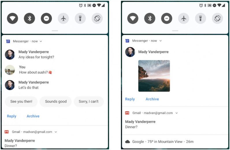
This is one area that Google is constantly trying to work on. The notification tray and quick settings have received changes in every update since Android Jellybean if I can remember correctly. KitKat brought the tiles, Lollipop was a complete revamp, and since then the notification tray and quick settings have been constantly getting visual as well as functional tweaks. Visually, everything is more rounded again, a trend that will continue in other parts of the UI as well. Functionally, you can now view images that someone has sent you in a message, right in the notification. That’s neat.
Android P is also a major overhaul when it comes to the quick settings tiles which haven’t seen many changes in recent years. The icons are now bigger, rounder, like everything else. To be honest I’m not a fan. With the dock and now this it seems like Google is taking a few steps backward. Notice the several pixels wide space between the quick settings and notifications. It was like this on Lollipop and I really loved it when Android Nougat got rid of those. Notice the gap between the screen edges and the notification tray and quick settings. Again, this was on Lollipop and I loved it when Marshmallow got rid of it.
Can’t say I like the all-around approach either. We know the Pixel 2 has rounded corners Google, we saw it.
Settings
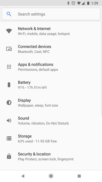
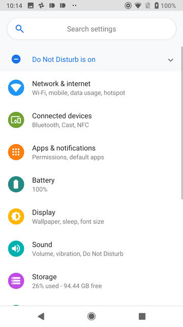
Finally, a visual change I can appreciate. The Settings app on Android P has received a visual overhaul too. Don’t worry, things haven’t been reorganized like last time, but simply made to look better. The dull monochromatic icons are replaced by more colorful and (… guess) round icons. The search header is slightly larger than before and yes, rounder but this the curves really look better. The background of the app is also a little whiter and looks nicer.
Power menu and Volume dialogue
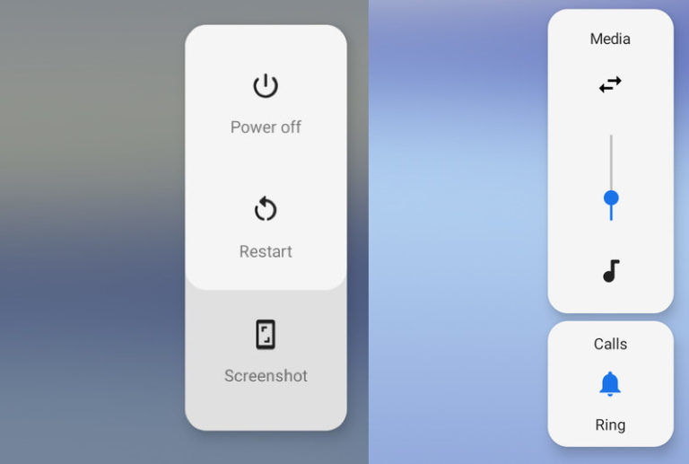
The power menu hasn’t received much of a change but simply an addition of a Screenshot option. Convenient, but the major changes here have been done to the volume dialogue. Like the power menu was brought to the side to make it easier to reach, the Volume dialogue now appears on the side as well instead of the top, and overall looks nicer than before. It’s also now easier to put the phone on silent mode now that one doesn’t have to reach atop the tall 18:9 screens. I already found it difficult with 16:9 screens.
Both the power menu and the volume dialogue do come in a darker shade when you change to apply a darker wallpaper.
Smart rotation
Auto rotate has been around for so long and it has had the same problem for almost a decade now. It can’t decide whether you really want it to rotate or you’re just laying comfy in your bed. Some OEMs have tried some sort of “smart” rotations but it usually relies on some sensors to automatically detect whether you’re viewing your screen horizontally. In short, doesn’t often work.
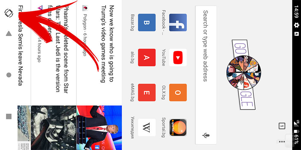
Android P apparently detects the screen rotation even when you have the auto-rotate off. And I’d advise you keep it off when you get Android P. Because then you’ll notice a small rotation icon on the navigation bar. It disappears if you don’t tap it, which is nice, but if you tap it the screen rotates. Really innovative Google, kudos. It’s one of the smartest features to have been introduced in recent history.
Excited?
Some of these changes are quite nice, some are just eh. But for the first time in history, stock Android looks like a skinned version of stock Android. That can be a good thing or a bad thing, what do you think?




Join The Discussion: