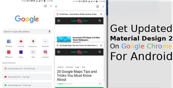
Android 5.0 Lollipop was a major step for Android as an operating system. Google was switching from its previous naming schemes for one. Android 4.0 and 4.1 were Ice Cream Sandwich, 4.2 was Jellybean, and 4.4 was KitKat. It’s easy to see how that could be confusing. Since Android 5.0 Lollipop, only major Android versions were given names. Another thing that changed was Android’s image as a geeky looking OS for geeks, to a polished operating system like iOS. The Material Design language was a hit and this helped unify the Android experience somewhat. It has been three years since a major design overhaul. But it seems Material Design is in for one, a Material Design 2 update could be on its way. A Material Design 2 overhaul has been in the works for Google Chrome on PC and now also on Android.
On Android, this new interface is being referred to as the Modern Design, whereas on PC it was called Material Design refresh. With the Modern Design enabled, the Chrome URL bar takes a more rounded shape, much like the new Google search widget on many Samsung Pixel 2 devices. The status bar also blends in perfectly with the color of the browser’s interface, which changes according to the webpage color. Previously, the status bar had a darker shade in any app, and also in Chrome. This is in accordance with the push towards a more rounded interface as we’ve already seen is coming with Android P. The Modern Design is still in development. That is why it is only available in the Chrome Beta and Chrome Dev channels. There too, it is available only as a hidden setting under Chrome flags.
So yes, we’re sure the Modern Design will make its way to the Chrome stable channel. Although, that might only happen around the time Android P officially comes out with Google’s new smartphones. If you are as enthusiastic as us and can’t wait to try out the new interface, rejoice because you can.
If you’re willing to install the beta version of Chrome instead. I’ve been using Chrome Dev and Chrome Beta for relatively long times on separate occasions. Generally, I have not run into enough problems that’d make me want to switch to stable. Do still keep in mind that if Google categorizes these builds as beta and dev, they do not intend for common folks to be using it. You may run into bugs.
Don’t miss: How to Make Google Chrome Load Pages Faster on Your Android
Install Chrome Beta
Fortunately, you don’t have to wander off on the internet looking for an APK because Google already makes both the beta and dev versions available on the Play Store. You can follow the link below to download and install Chrome beta on your Android device.
[googleplay url=”https://play.google.com/store/apps/details?id=com.chrome.beta”/]Enable the Modern Design flag on Google Chrome Beta
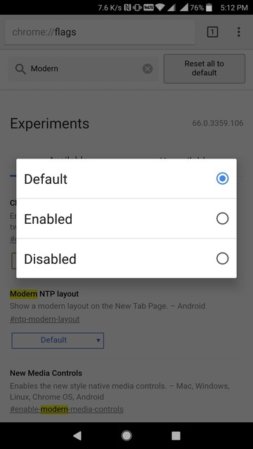
Launch Chrome Beta once you have it installed, enter chrome://flags/ in the URL bar to access the Chrome flags page. This page contains all sorts of hidden settings that Google does not want a normal user to accidentally turn on. On the top of this page is a search field. In the search field, type Modern and you should already see the Chrome Modern Design flag listed at the top of the Alternatively, you can just go directly to the right flag by entering chrome://flags/#enable-chrome-modern-design in the URL bar. Touch the drop-down menu that has Default selected by default.
From the pop-up, select Enabled. When you do, you’ll see a blue button appear on the bottom that says RELAUNCH NOW. Alongside is a message saying the changes you made won’t take effect until the next time you launch Chrome. Tap on the RELAUNCH NOW button and Chrome will close and launch again.
Enjoy a brand new Material Design 2 on Google Chrome
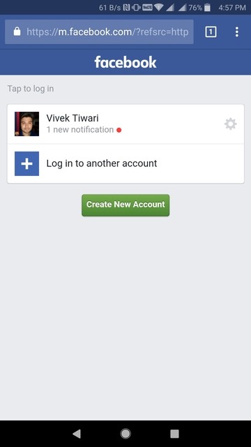
When Chrome launches again, you may or may not see the changes right away. In case you don’t see any change, close Google Chrome again manually, remove it from the recent apps list and launch it again. When it does you should be seeing a refreshed design. The URL bar is rounded, as mentioned, and you can see how the color of the status bar changes in the screenshots below.
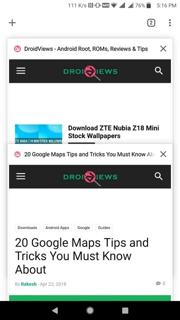
If you look close enough, you may also notice the tabs button is slightly more rounded. While the tabs switcher space had a dark material background, it didn’t flow over to the status bar.If you’re alarmed about Google making Android more and more white, you might not love this part. The tab switcher space in Material Design 2 or the Modern Design is white but the status bar blends in nicely with it.
Must read: 3 Lightweight Facebook App Alternatives for Android






Join The Discussion: