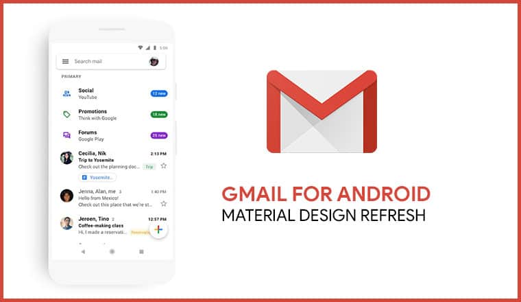
Gmail for Android just received a major update that revamps its UI. Let’s take a look at the new features the new big white Gmail update.
Last year, we saw Google slowly roll out a new material design theme to some of its apps as well as a new design for Google Chrome on both desktops and mobile. Gmail for desktop received it too. We thought it would be called Material Design 2 but it got the name Material Design Refresh.
The company is continuing to roll out the bright design update to more apps. Back in January this year, they announced a Gmail update for Android featuring the new design and some new features. The big white Gmail update for Android is here now, so what’s new?
Gmail update for Android
First off let’s address the white. it’s too white, agreed, but it’s a much-needed design refresh at least in my opinion. The Gmail Android app had gotten pretty stale over the years. The new design brings something fresh to the app. It’s no Inbox (which Google killed 
Did you know? You can recover permanently deleted emails in Gmail, click the link to learn how you can do that!
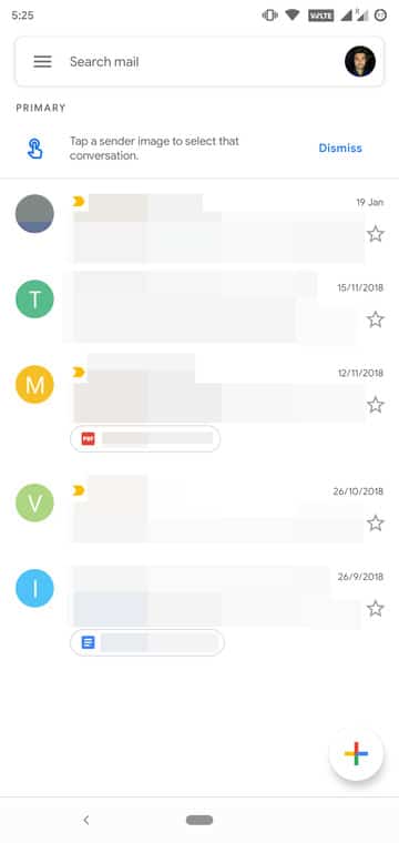
Then a Welcome message greets you and after you tap Next you’ll be allowed to select a view: Default, Comfortable, and Compact. It’s best to let the Default view on because it’s the only view where you can see email attachments without opening the mail. That’s the one feature that you get with this update and I don’t see why you would want it to go away. If you want you can try something else and then change this back later in the settings. Anyway, once you get past that you land on your Primary Inbox.
So, you don’t like lots of whites on your phone’s screen? Try one of these 5 Android web browsers with black theme or night mode.
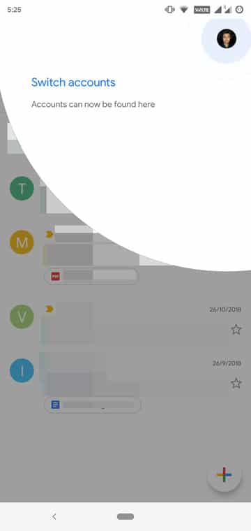
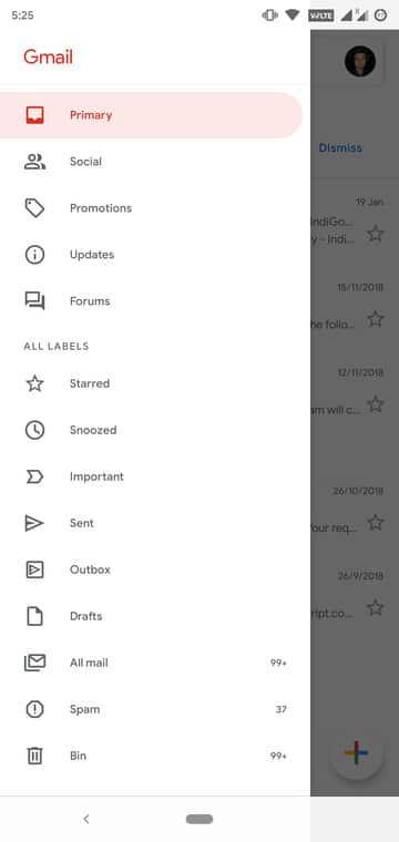
Admittedly, the new inbox looks pretty clean in comparison. It is also now slightly easier to manage your accounts. The accounts section has been pulled out from the side menu drawer and instead placed as a button on the search bar above. That does save a couple of extra taps. Speaking of the menu drawer, it looks much cleaner as well. You can still access the Settings from here. In Settings > General settings, you can also find the Conversation list density option. This is where you can change the view mode, in case you made the wrong choice the first time.
A dark mode might be coming… hopefully
Not all of us are big fans of the super bright white apps that Google has been pushing lately. First, they went from holo to Material, but it had some color. This time around though colors are only secondary and mostly all you see is white. It’s nice for bright environments or in the day but in the night it could be really blinding. Google itself admitted that they’ve been pushing devs towards the wrong color. We’ve seen a series of Google apps get a dark mode in recent times. So maybe a dark mode is on the way in the next Gmail update? Fingers crossed. But don’t hold your breath because it might be a while.





Join The Discussion: