Over the past couple of years, there have been so many Pixel Launcher mods and other launchers based on the Pixel Launcher that you’d be forgiven for not being able to keep up. Forget the number out there on the internet, the Google Play Store itself is home to many Pixel Launcher inspired launchers. Pear Launcher is probably the best Pixel launcher alternative you should try.
Clearly, when Google impresses everyone with their launcher but refuses to provide even basic customization options, it opens up a market of users wanting more out of Pixel Launcher. We’ve reviewed a few of these such as Lean Launcher and Flick Launcher. Pear Launcher is another one to join this list, but does it do enough to stand out?
Install Pear Launcher
Pros
Pear Launcher is a lot easier to set up than Nova Launcher or Action Launcher if you’re going for a Pixel Launcher look. Like Lean Launcher, Flick Launcher, and the likes, Pear Launcher defaults to the original Pixel Launcher look. There is no search bar anywhere on the desktop by default. In case you want it, you’ll have to manually add it. Under Settings > Dock you can also enable the dock above or below the dock icons.
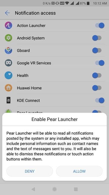
The Google Now pane on the left is available, with an additional plugin or add-on app, of course. However, I like Pear Launcher’s implementation more than others for one reason. If you go to Settings > Google Now you’ll find the option to enable the Now pane as an overlay. This is the smoothest transition to the Google Now pane I have ever experienced on a non-Pixel phone. No matter how slowly you pull it, there’s not even the smallest jittering, and it slides over in a buttery smooth animation. Sometimes even the smallest of things leave an impression, this is one of those.
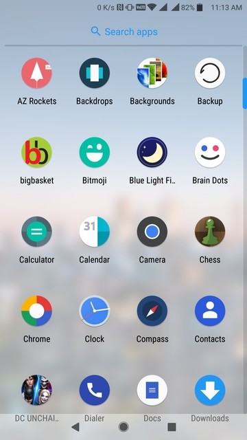
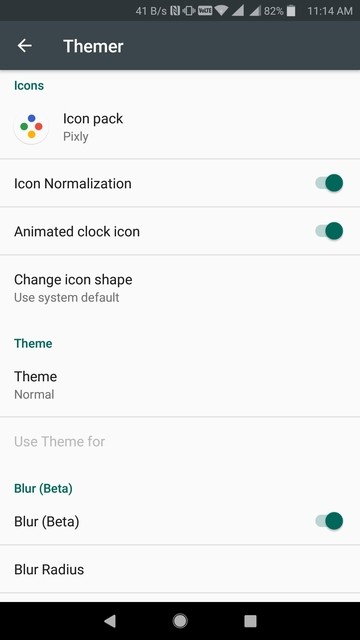
Other than those basic Pixel Launcher things, it does let you apply icon packs and even lets you change individual app icons and labels. There’s an animated clock icon, which works even if you apply an icon pack. That’s not the case with Action Launcher which I normally use. There’s a lot to like here. For instance, the Themer section even has the option to blur the dock, folders, and app drawer backgrounds. Lawnchair Launcher has it too and I do love the feature. Never hurts to have it when you’re feeling adventurous.
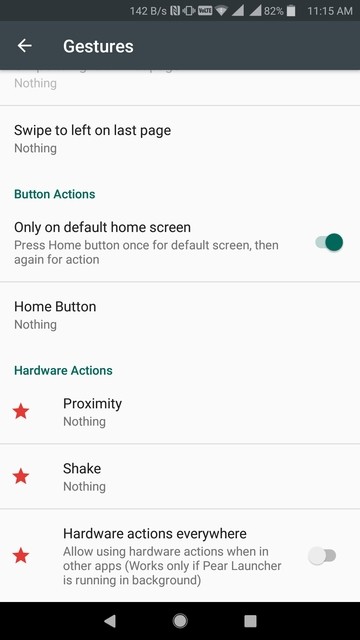
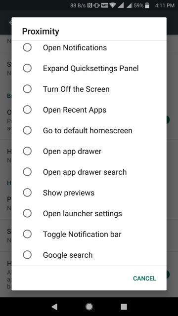
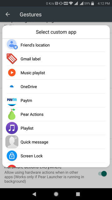
Many of the features that you would expect Nova Launcher to have are here. Even if a few minor features are missing, Pear Launcher makes up for it with other features. Quite like Flick Launcher, some of the features here you won’t find on Nova Launcher. For instance, Hardware Actions that let you assign an action to a gesture that can be picked up by your device’s proximity sensor or shaking the device. The best part is you can use these gestures in any app, not just on your home screen. Of course, it does support normal gestures such as single or double finger swiping. You can choose from a variety of actions for each gesture or set your own custom actions.
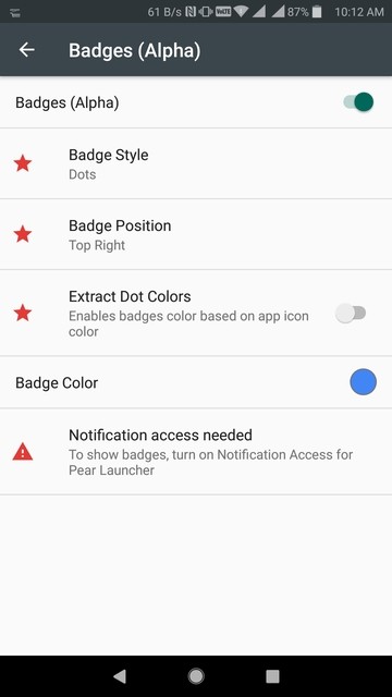
Most of these features are also free other than a few such as multi-finger gestures, hardware actions, and notification badges. If you don’t want to pay up though, the launcher offers a lot of features without asking for anything. There are no ads either even in the free version.
Drawback of Pear Launcher
If we ignore the other options available out there, there isn’t a lot to not like about Pear Launcher. We found a bug though where you can’t hide apps directly from the drawer. Normally, the way you do it on any other launcher, as well as Pear launcher, is to long-press an app icon, select Edit and then you can hide the icon from the drawer. A bug on Pear Launcher does not let it happen even if you turn on the toggle to hide it.
The developer suggests that you should go to Settings > App drawer > Hidden apps and hide at least one app. Once you do, the bug is resolved. This happens currently in Pear Launcher version 1.3.3. The good thing is that the developer knows this and you can expect the bug to be fixed in a future update.
Furthermore, for a launcher that tries to sell itself and a feature-packed Pixel Launcher, you would think it would cover all the bases first. Somehow, I couldn’t find anything that replicated the At a glance widget from the latest versions Pixel Launcher. You’ll have to make do with a widget of your own or use Another Widget.
Verdict
Pear Launcher is a well-done app and some people might find it easier to use even than Nova Launcher. If you haven’t already paid to have Nova or Action Launcher, I would suggest that you give serious thought to Pear Launcher. It is relatively cheaper and packs in almost the same number of features. It only helps that Pear Launcher provides most of the Nova Launcher features for free. Therefore, you can check it out without paying a dime.
Must read: Pixel Launcher Mods Brings Icon Packs and More to Pixel Launcher
The paid features work like a charm as well. It also supports what it calls Smart folders which is basically letting you hide a folder behind an app icon. Tapping on it launches the app while swiping up on it opens the folder. If you’re a Nova fan, I’d love to hear why you think Nova is better because I clearly can’t find a reason anymore. If you’re a fan of the unique elements of Action Launcher, such as the Quick drawer, Quick page, adaptive themes, etc. you won’t find those here.
[googleplay url=”https://play.google.com/store/apps/details?id=com.pearlauncher.pearlauncherpro”/]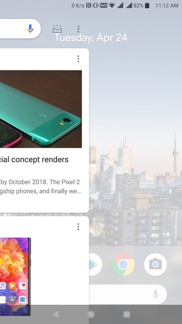



Join The Discussion: