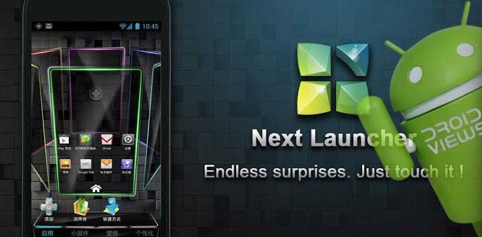
After being under public testing for four beta versions, the Next Launcher has finally made its entry at the Google Play Store. Since I had already tested all the test versions, I was more that curious to know what this launcher app is like now because it has been launched as a premium product. I generally do not spend money on launchers and keep myself satiated with the free ones, but I do not know under what spell I bought it from the market.
Anyway, I downloaded the 2 MB app and installed it on my S3. I found it different from the beta version. It was faster, smoother shinier and loaded with a few new features. The launcher does not have any other theme than the default one. In fact, there was no option for themes at all. It disappointed me a little. The 3D animation at the launcher, app drawer and settings panel are stunning but limited number of customization made me think- “is this what I spent money for?” I mean if it was priced at a dollar or two, it would still have been an okay launcher, but for $16 I would easily say a big “NO”.
It might sound a negative or biased opinion to some of you, but one can’t help express what one really feels. I only hope that future updates and enhancements make this launcher more attractive and functional. Till then, bye to Next Launcher! What do you think? Do not forget to share with us.
[googleplay url=”https://play.google.com/store/apps/details?id=com.gtp.nextlauncher”]


Join The Discussion: