By now, almost everyone knows about Facebook’s companion Messenger app and its lighter version Messenger Lite. When Facebook introduced its own Messenger app to compete with WhatsApp and the others, it didn’t make much sense. Why should users download another app just to message friends on Facebook? Well, the company answered by removing messaging from its official app. To say the Messenger app started on a rocky relationship with users wouldn’t completely be wrong. Things soon started to look good though as users accepted Messenger and the app adopted Material design, it was all going great. It even managed to gain 1.2 billion monthly active users.
Along the way, the company also managed to buy WhatsApp. Then began Facebook’s Snapchat-lexia and like all other apps owned by the company, Messenger became a mess trying to include a built-in Snapchat. I can’t possibly be the only one irked by those unwanted features. The constant UI redesigns to incorporate Snapchat-like features made Messenger the mess it used to be. Luckily, Messenger Lite arrived soon and it is quite good. It lets you message your friends on Facebook and … nothing. It does what it is supposed to do and nothing more. I, for one, am a fan of its philosophy. What? It consumes less data and resources too? Awesome!
These are probably the biggest reasons why Messenger Lite has made it to Google’s most popular apps of 2017 lists in so many countries. You do end up missing out on all the fancy features of the original Messenger app though. Here’s a quick comparison of how the two Messenger apps from Facebook fare against one another.
Also see: How to Enable Hidden Internal Settings on Facebook & Messenger Apps
1. Storage and Memory
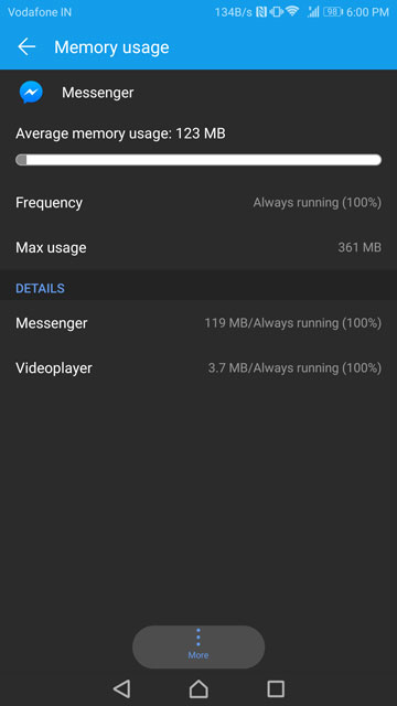
The original Messenger app like the Facebook app takes pride in consuming resources. Even a fresh installation takes about 150MB or more storage space which only multiplies as and how you use it. It also uses 100MB of RAM or more on average with the maximum usage crossing 300MB. Not very long ago I had a phone with 512MB RAM.
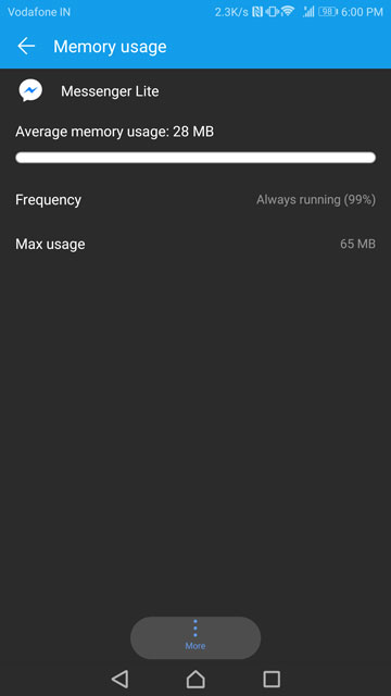
Messenger Lite, on the other hand, takes up only 28MB of storage space on my phone. This is when I’ve been regularly using it for over a month now. The average RAM usage is around 29MB and the Maximum RAM usage should stay around 70MB or below for most people as well.
2. UI Design
UI design is one of the very important parts when you’re creating an app. An ideal UI follows the philosophy of efficiency in simplicity. Meaning the UI should not confuse users, and the important parts of the app should be easier to access than something like the option to change the color of notification LED. Quite frankly, one of my biggest gripes with Facebook’s Messenger app has been the UI. And it was so for a long time even after Facebook bought WhatsApp, an app made popular because of its simplicity. The developers finally managed to hit the right notes with the UI but that was until Facebook caught the Snapchat disease.
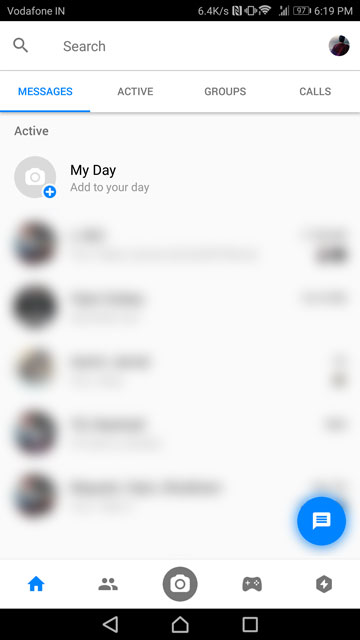
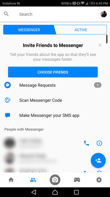
With recent updates though, the Messenger app has come a long, long way. But it is still not consistent. When you install it, it’s all nice and blue, showing how nice the UI could have been without the bloat. Soon after a restart, it just magically transforms. I’m still not a fan of it but maybe you are. There are tabs up at the top and then there are more icons on a navigation bar at the bottom.
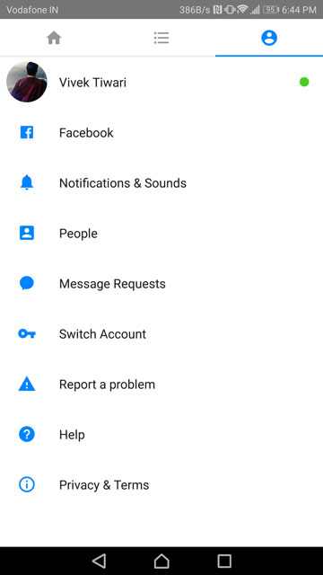
At least there is a distinction, of sorts, between the tabs on the top and the icons at the bottom. Most of the Messenger’s “extra” features are concentrated at the bottom – Home, Contacts, Camera, Games, and Bots. Messages, Active, Groups, and Calls buttons are at the top along with the search bar and the Me bubble for the user profile. All I can see is clutter.
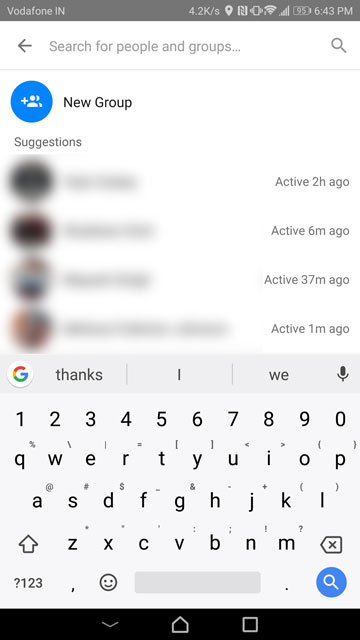
Messenger Lite’s UI design couldn’t possibly be any simpler without having any negative effects on user experience. It focuses mainly on the “messages” and it is not just because it lacks all of the extras. Take Groups for example. On Messenger, Groups have their own separate tab where you can create them. On Messenger Lite, you can create new groups by tapping on the floating + button also used to create messages. Because ultimately, that button stands for creating/adding stuff. It just seems so much more intuitive that cluttering the interface with things that need not be there. It is as if the apps were developed by two different groups of people.
Don’t miss: How to Hide Active Status on Facebook Messenger
Unfortunately, that’s not all. I could actually write a big fat article just about how Messenger Lite’s UI is better than Messenger’s. For now, let’s move on.
3. Features
Sure Messenger Lite annihilates Messenger in UI design and resource efficiency but it pays for it with features. With Messenger Lite you can send and receive messages, images, voice notes, and stickers and make/receive audio calls using Wi-Fi. You know, mostly the stuff you want to do in a chat app. But it also lacks quite a few features compared to the original app. We’re not talking about the features nobody cares about but features that you do want in a chat app.
One of the missing features is the ability to make Facebook video calls which is a bummer. There is a good chance you also have other video calling apps like WhatsApp, Google Duo (just kidding) and Skype. But let’s assume you don’t and take the points away from Lite.
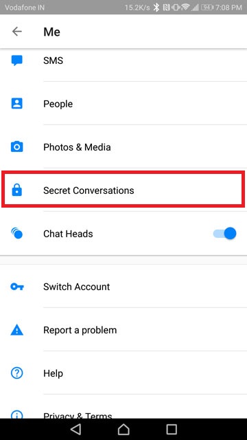
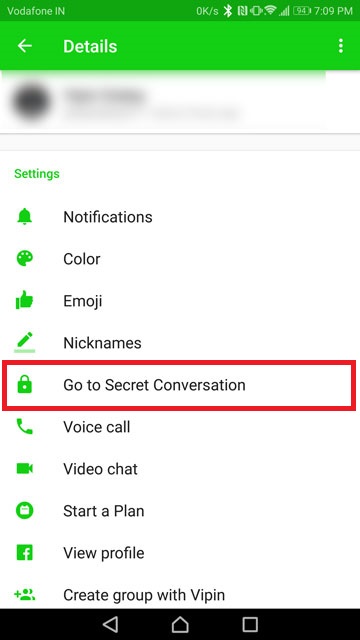
Another feature that is very important, especially in this day and age is end-to-end encryption which is also nowhere to be found on Messenger Lite. The original Messenger app does offer that but most probably you are not using it. Why not? Well, because the UI does a pretty good job of hiding the said feature. (Slow claps)
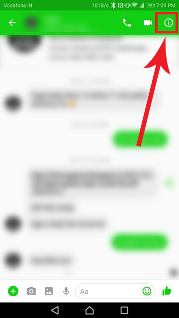
There’s a mention of it in the Me section of the app but to actually use Secret Conversations you’d have to tap the i button in the top-right of a conversation thread.
To add to the list of missing features, Lite does not support GIFs or stickers. This is most probably intentional since the app focuses on consuming less data. You also can’t send multiple images at once for some reason. This can’t be intentional because Messenger Lite does not actually load images unless an image is tapped upon. It also lacks location sharing.
Must read: 10 Facebook Messenger Tips and Tricks You Must Check Out
Not to mention the “My Day” feature from the original app along with Games and Bots are obviously not found on Lite. But these aren’t really the features that I miss. These are the features that made me switch.
[googleplay url=”https://play.google.com/store/apps/details?id=com.facebook.orca&hl=en”/] [googleplay url=”https://play.google.com/store/apps/details?id=com.facebook.mlite&hl=en”/]You’ve clearly figured out which of the two I prefer despite a serious lack of features (it’s not Messenger). Which do you prefer?




Join The Discussion: