You’ve probably never heard of this one, but each year Google hands out the Material Design awards to 4 apps from the Play Store. There’s not a quantifiable method used to give these awards. They are simply awarded to the four apps that Google thinks to use its design language in excellent ways. The winners for 2019 have been announced and these are all relatively unknown apps. I’m not surprised because most well-designed apps never get to be as popular as some of the badly designed ones. These are the 4 apps that won the Material Design Awards 2019 based on standards like experience, universality, innovation, and theming.
Winners of Material Design Awards 2019
Trip.com (for Universality)
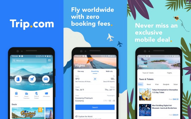
[googleplay url=”https://play.google.com/store/apps/details?id=ctrip.english”]A thoughtful and inclusive design tailored to the needs of a wide range of users.
Trip.com, as you can tell, is a travel app but unlike most this one is designed to not look cluttered. The app uses material design and makes efficient and plenty of use of white spaces. This makes everything look much cleaner and better spaced out. The app not only allows you to look around for tourist destinations you should visit but also book flights from within the app. Trip.com also lets you book hotels, find deals, and even rent cars. In China, the UK, and a few other countries, it also lets you book train tickets. The design flow of the app makes usage a breeze. As a result, users don’t have to fiddle around to find things or be confused about how it all works. Exclusive members can enjoy special deals and zero booking fees on flights and hotels.
Scripts (for Experience)
[googleplay url=”https://play.google.com/store/apps/details?id=com.languagedrops.drops.scrips.learn.write.alphabet.letters.characters.language.japanese.korean.chinese”]A creative and effective deployment of interaction, navigation, and content in service of an impactful user experience.
You’ve probably seen a ton of apps that focus on teaching users different languages. They’re all mostly focused around spoken language, however. The Scripts app allows users to learn how to write in other languages using material design to create a beautiful, and easy to navigate app experience. Scripts presents a step by step drawing guide with clear instructions and stroke order with animations and haptic feedback. All of that combines to make a great learning experience. The app may use a material design but it is also a minimalist design where the UI tries to mostly stay out of your way. Apart from all that, the app manages to stay consistent with the typography despite supporting such diverse languages. Some of these are Korean, Japanese, Chinese, Hindi, Russian, Latin, etc.
Ruff (for Theming)
[googleplay url=”https://play.google.com/store/apps/details?id=ruff.ruff”]An expressive brand identity executed with Material Theming, including the consistent application of color, typography, and shape.
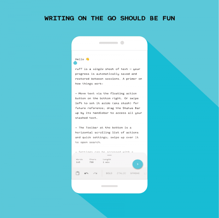
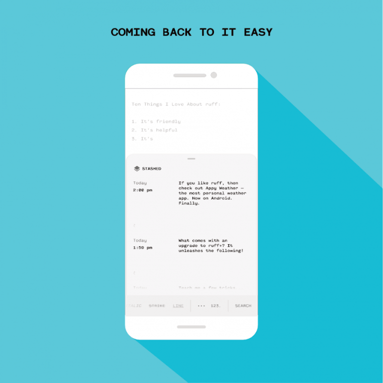
Ruff is a note-taking app at its core and there’s no lack of such apps that make great use of material design guidelines. The initial layout is simplistic, as you can see in the screenshots but users can customize that and themes as they want later. Once you’ve written down something you can just swipe from the right to save or stash it. Ruff acts as a continuous sheet of paper so all your notes are simply stashed on top of each other in a timeline fashion. It’s also available for Chromebooks and features a dark theme in case you need to do some writing in the dark. Ruff is a very minimal app with a blank backdrop that invites you to write, while the curved corners of the bottom sheet and the handlebar convey that more information can be revealed by swiping upon it.
Reflectly (for Innovation)
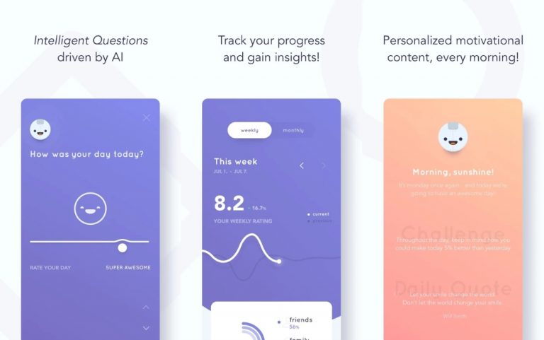
[googleplay url=”https://play.google.com/store/apps/details?id=com.reflectlyApp”]A demonstrated ability to build upon and extend the Material Design system in inspiring new directions.
Reflectly is a journaling app and before you say no to that, just hear us out. At some point in our lives, a lot of us have had the urge to start writing a journal because it seems like a cool thing to do. But then you start and it seems stupid maybe or you just get bored and stop doing it. Reflectly encourages you to keep doing it, and that’s unlike any other similar app. For one, it is designed to keep things calm and fun instead of looking like a boring journal. It uses various prompts from a conversational, AI-powered UI.
These are all the apps to have won the Google Material Design Awards for 2019. Google does not offer any cash prizes to the developers of these apps. The developers do receive a classy-looking statuette and their apps get exposure on a dedicated page.
If you’re interested in what Google had to say about these apps, you can check that out on the official source page.


Join The Discussion: