
The Google Play Store has been home to a simple Android launcher by Google for many years now. In case you’ve forgotten, it is called the Google Now Launcher. Yes, it still exists. It wasn’t a very inspiring redesign but it did introduce people to the benefits of having Google Now a swipe away. It wasn’t until the first Pixel Launcher that Google captured the imagination of many developers, OEMs and users alike. Lean Launcher brings the amazing pixel Launcher experience in a more customizable way.
These days almost every OEM launcher has a swipe to access the app drawer gesture. Third-party launchers such as Nova and Action and plenty others have adopted it. And yet, many more third-party launchers are cropping up with the rootless Pixel Launcher as their base. Building on top of what is already a pretty decent choice seems like a good choice. Lean Launcher is another launcher on this list, building atop the Pixel Launcher and adding features to it that Google won’t.
The concept may sound familiar if you’ve been on the lookout for a Pixel Launcher port or a Pixel Launcher-like launcher. We’ve even reviewed one of those at DroidViews. It is called Lawnchair Launcher and its a pretty good choice too. The launcher has since debuted at the Google Play Store. Whether you prefer Lawnchair or Lean Launcher will depend on what you want. You could always go back to your Nova or Action if these light-weight and simple Pixel style launchers don’t fit your bill.
Install Lean Launcher
[googleplay url=”https://play.google.com/store/apps/details?id=com.hdeva.launcher”/]Where it excels
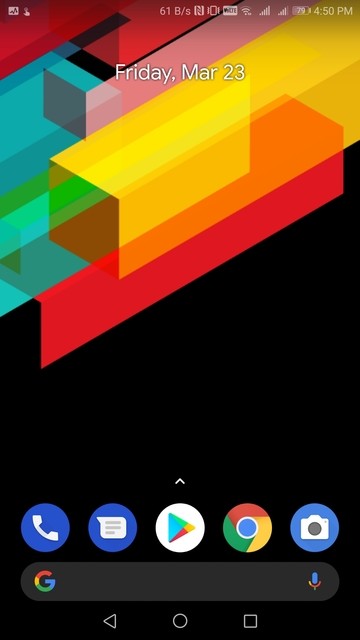
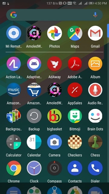
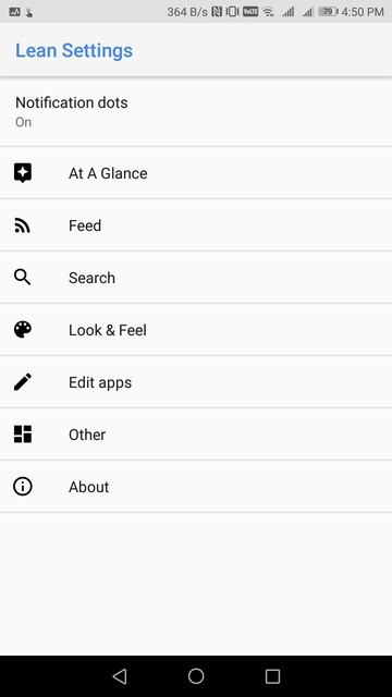
Let’s start with the good things. It promises a Pixel Launcher like experience and it delivers, somewhat, at least as far looks go. It has the search bar at the bottom, supports a Google Now pane, sort of, and also has the At a glance widget. Customization is Lean Launcher’s biggest weapon over Lawnchair. Lawnchair Launcher does offer some customization such as icon packs but Lean Launcher offers much more than just icon packs. Apart from the usual Pixel Launcher features, Lean Launcher supports hiding the bottom search bar so you can manually place one on the top, in the middle, wherever you prefer. Similarly, it lets you hide the At a glance widget and the search bar in the app drawer too. In essence, you can choose whether you like the new changes introduced in the Pixel Launcher after Google Pixel 2.
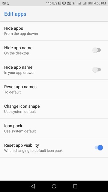
It also lets you customize the search bar at the bottom by forcing the Google colors on the Google and mic icon in the search bar as well as select between a dark or light background. Similarly, you can select between a dark or light App search bar. Don’t like the gradient background of the dock? Make it transparent or simply add a solid background. It lets you change individual app names and select whether you want the default icon for that app or the icon from the applied theme. You can’t pick up an icon for it manually. There is a spring animation effect when you slide the app drawer up like on the Pixel devices. It is quite minimal though and you may not notice it if you’re not looking.
Where it doesn’t
So it’s quite customizable but it’s not the perfect choice. For the At a glance widget to work perfectly, you will need a Lean Launcher companion app which the developer says can’t be released on the Play Store. The reasons why the launcher even needs a separate app for this to work is unclear since Action Launcher does do a pretty good At a glance widget without needing an extra app.
Furthermore, Google Now pane requires the companion app as well, but this is understandable. So far no launcher on the Google Play Store has brought the Google Now pane without a companion app. Although you should note that you will need to download a separate version of Lean Launcher from Github to get it working. Or you can wait until the feature rolls out to the version available in the Play Store.
Also read: Customization Tips for Android #1: Best Home Screen Setups to Try
The very first thing I noticed about the launcher though was not that it was customizable, or the other details. It was that the app drawer pull up animation was not smooth. It’s a little jittery at the beginning almost suddenly jumping up and then it follows your finger smoothly as it is supposed to. No matter how fast or how slow I pull up the drawer there’s always a delay. It ruins the whole Pixel experience, that is supposed to be fluid. That I would count as the biggest negative because you’re going to be pulling the drawer up pretty often.




Join The Discussion: