The best part of Android being open source is the ability to customize it. The extent up to which a device can be customized is limitless. From navigation bar to status bar, notification panel to quick settings and what not. However, some of the customization mentioned above requires root access. While many of you might be familiar with the term while others might not have heard of it. However, that is a completely different topic and I don’t wanna lean towards it. The reason is that it won’t be necessary.
The customizations that we are going to apply today will be based on home screen along with a few other custom tweaks. However, none of them will require root access. This customization can be done on any smartphone. Here, we will not only talk about the various ways which will make your smartphone more appealing to the eyes but also give you a few examples.
Note- The examples mentioned in this post might not require the exact same setup as mentioned here. This is because of the difference in the dpi level and screen size. However, fumbling with the numbers can even result in a better style.
Must read: 3 Nova Launcher Tricks You Should Know
Using third-party apps is a great way to customize any smartphone. Everyone is not high on memory. Therefore, too much of apps can slow down the system and make it difficult for the system to multitask. Today, we will use the minimum bare apps required to create an interesting yet different looking home screen.
Grab a Few Apps
- A custom launcher (Nova or Evie recommended). No need to download a custom launcher if you have LG, Xperia Home, ASUS Launcher or the OnePlus Launcher. A custom launcher is basically required to customize the icons, grid size, backgrounds, transparency, dock, folders, scrolling effects and a lot more. Make sure not to grab the APUS launcher or anything similar to it. This is so because they have cleaner and RAM booster built in. Trust me it doesn’t work. Moreover, spoils the overall look and feel of the home screen by placing a broom or circle icon attached to the wall of the screen.
- An icon pack, I mean, a really good icon pack. It should not only look good but also must support a lot of icons. Make sure to check whether the icon pack has an icon request feature or not. This feature is really helpful in the long run.
- Finally, Backdrops. Backdrops is a much-anticipated app for downloading wallpapers. It provides some effective methods for browsing through the catalog. It has a number of categories to choose from such as minimal, abstract, etc.
That’s it. Believe me or not. With the above three apps, one can do wonders. In addition to the above apps, the only other thing that would be required is creativity and a few minutes to execute it.
Also read: Customization Tips for Android #1: Best Home Screen Setups to Try
Examples of a Few Home Screens
Crossbones
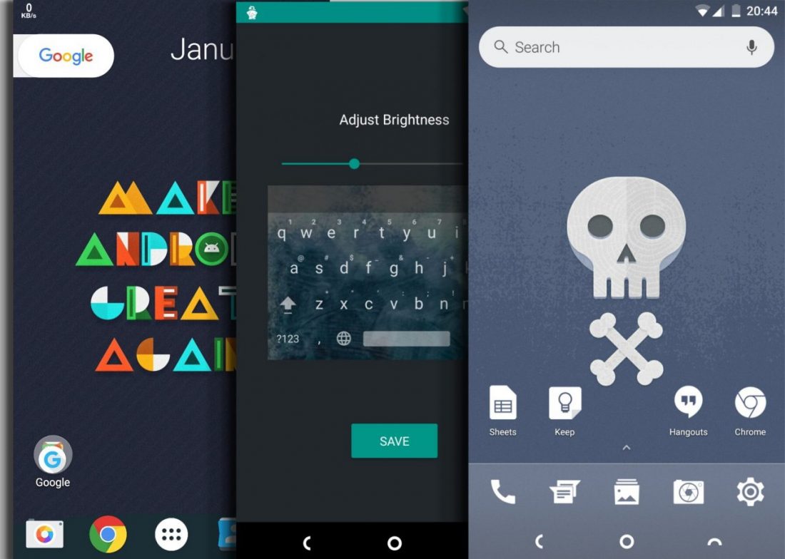
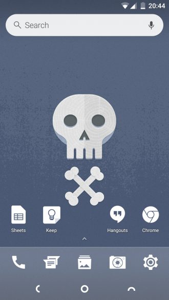
We call this theme crossbones because of it’s not that much minimalistic design and bone white color. Basically, this screen represents 2-3 contrasting colors varying in saturation. This can be a great example of how to set things up.
A quick catch up on how this was made possible. Evie launcher combined with Whicons icon pack was used in this setup. If you want to know the exact numbers for grid size or icon size. Don’t worry we have got you covered.
Don’t miss: How to Make Your Phone Look Like Google Pixel
Setup
- Hold the screen to retract it. This will bring out the settings option. Click on Settings.
- Click on the home screen. Here the grid size is 6×5 (6 Rows and 5 Columns). Icon size is decreased to 90.
- Next up is the dock. Here the number of columns is 5. The icon size is 70.
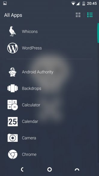
- The app drawer is set to the vertical list as shown. This can be done easily. Open the app drawer at the top right there will be two options select the list one.
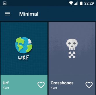
- Finally, for the wallpaper, I used the Crossbones wallpaper that can be found under the minimal category of the Backdrops app.
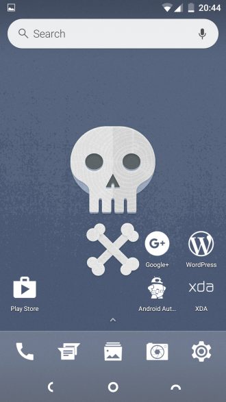
One thing to notice on the home screen is that the icons don’t cover the wallpaper. Even if we scroll through the pages. However, the screen features almost all the necessary widgets and icons one would need. The search bar is there along with the space to accommodate almost a dozen of icons. Despite keeping it clean, functional and appealing to the eye.
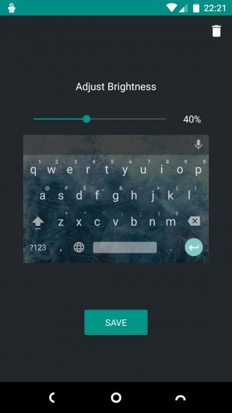
I forgot to mention you can also customize your Google keyboard which we will be covering here. It definitely serves as an icing on the cake. Navigate to Settings» Language & input» Gboard» Theme» My Image. From here, choose an image that matches your design. Remember you can also zoom in and out and adjust the brightness to make the keyboard come themed out as you wish.
Recommended for you: 4 Awesome Icon Packs You’ll Love [#4]
Swolfand
The reason behind naming this theme Swolfand is quite a long story and we have more important stuff to cover. However, if you really want to know then let me know in the comments below. So, let us get ahead of it. The apps used to create this setup is Nova launcher (Prime is optional) combined with the Moonshine icon pack.
The setup for this process is long and it is certainly not worth the time that will be put into typing it as well as reading it. Therefore, we will highlight the places where the changes were made. The best thing is that this theme can include a lot of widgets without making itself appear dirty or unappealing.
Editor’s pick: Arcus – Best Android App For Editing Themes
Where were the changes made?
- Desktop
- App & Widget Drawers
- Dock
- Look & Feel
One important thing to highlight is that this home screen contains an arc on its dock. If you have an eye of an eagle then you probably might have already seen it. Another thing, make sure to change the Scroll Speed and Animation Speed to Stock from the Look & Feel options in settings.
That’s it, guys. We will be back with even more customized home screens later. Let’s have a look at what you guys make. If you have any good ideas post it in the comments below and we will add it in our next post.






Join The Discussion: