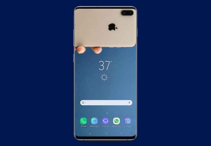
Samsung has been one OEM that has tried to steer clear of the notch design more noticeably than others. Although Samsung did finally embrace it with their mid-range and budget smartphones, it did manage to avoid it on its flagships. The Samsung Galaxy S10e, Samsung Galaxy S10 & S10 Plus house the selfie camera in a small display cut out instead. The hole-punch display has inspired many artists and designers as is evident from the plethora of hole-punch wallpapers for Galaxy S10, S10e & S10 Plus.
The notch has been more universal throughout the last year and this year as well. Yet, we never saw so many wallpapers or apps embracing the notch, hiding it or highlighting it. The hole-punch is an entirely different story though.
100 Hole-Punch Wallpapers for Galaxy S10e, S10 & S10 Plus
We have about a hundred different wallpapers designed by various artists and shared by various people all over the internet. The hole-punch wallpapers are also in various resolutions, as a result. We don’t take credit for either of these but it would be nearly impossible to find and give credits to everyone who has contributed to these wallpapers.
Must Read: 10 Samsung One UI Features You Should Know About
These wallpapers were designed for the elongated hole-punch on the Samsung Galaxy S10 & S10 Plus, as well as the Galaxy S10e. It’s probably not hard to discern which wallpapers are meant for which phones. We have included some of the wallpapers above to give you an idea. You can find all of them and many others in the zip file linked below the images. Try these hole-punch wallpapers on your Galaxy S10 or S10 Plus and let us know if they fit your phone’s display.
Samsung-Galaxy-S10-Hole-Punch-Wallpapers.zip | 78.8MB
Download Thousands of Stock Wallpapers
Problems with the hole-punch
There are still some people that aren’t fans but mostly it was fairly received by reviewers and enthusiasts alike. That’s probably because we’ve all been so accustomed to notches now that a glaring punch hole in the display looks refreshing instead of hideous. That, however, doesn’t mean that the hole-punch does not pose some problems. For one, Samsung had to make the status bar much thicker than it needed to be.
A small notch would’ve easily fit into the default width of the status bar. Since a hole-punch leaves space between itself and the top-edge, it cuts in deeper into the display. As a result, the status bar has to be taller or else the hole-punch cuts into the content on the screen. That wouldn’t have been nice.
Don’t Miss: Display Notch – A Good or Bad Thing? Our Honest Opinion
Moreover, the elongated hole-punch on the Samsung Galaxy S10 & S10 Plus actually is harder to avoid than a notch. Especially while watching a video or viewing a photo. Then there’s the fact that it does not perfectly align with the curved corners of the phone and is a little off. So it’s neither in the center nor perfectly in the corner. It wouldn’t exactly trigger trypophobic people but it’s still something you cannot unsee.


Join The Discussion: