
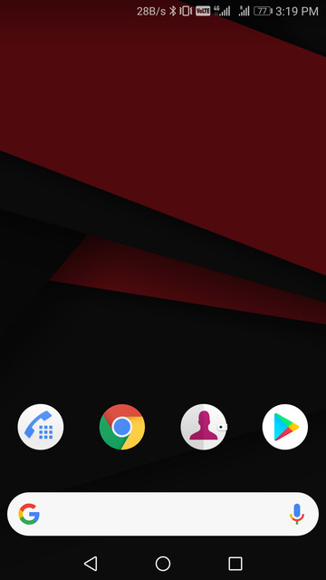
With Google slated to unveil the successor to its first-ever smartphone on October 4th, the rumor mill is spitting out a lot of rumors. Almost everything is already known about the two upcoming flagships from Google. Reputed leaker Evan Blass recently leaked a couple of Pixel 2 renders that you can see below. The only new information these renders had was the position of the Google search bar. Not only is it at the bottom, thus easily accessible, but it is also in the dock along with the icons. Whether that looks better than before is a debatable topic. But if you would like to replicate Pixel 2 look onto your Android, here’s how you can.
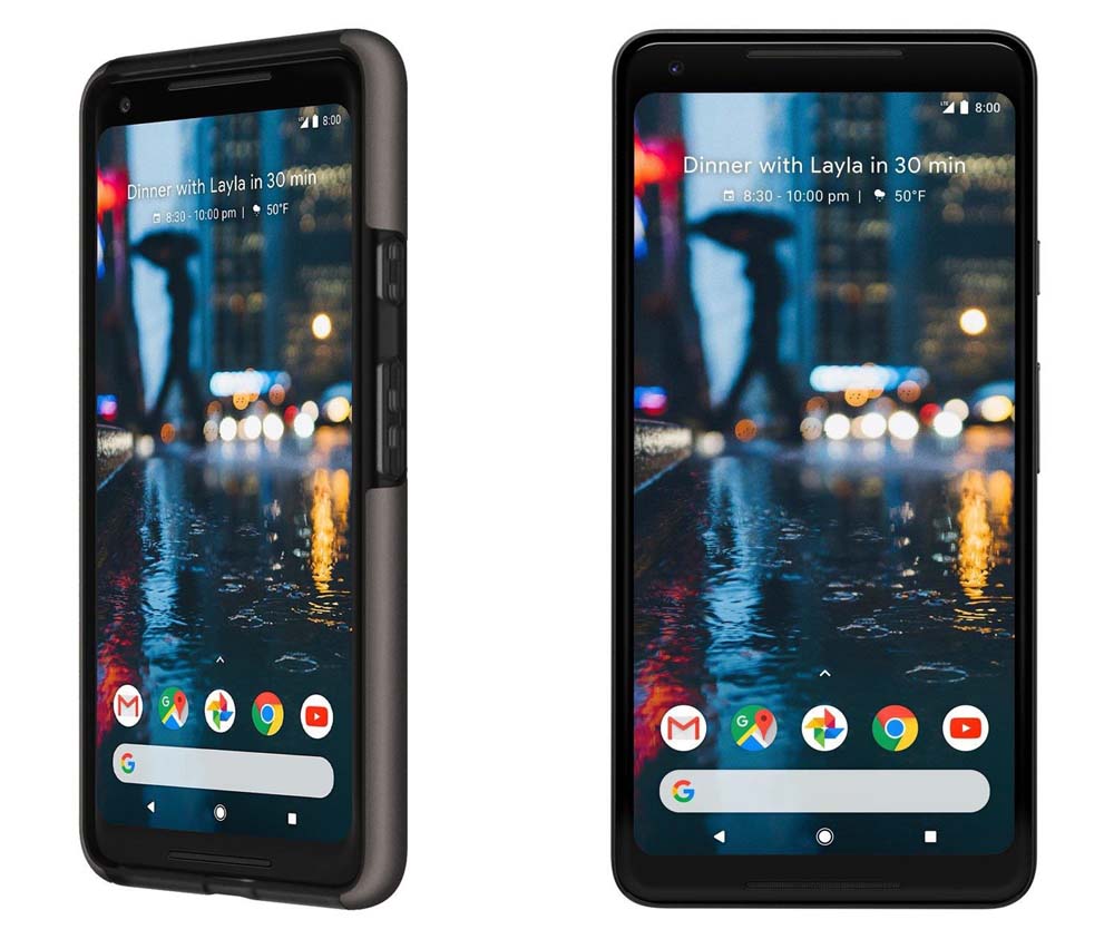
Don’t miss: Download Google Pixel 2 Stock Wallpapers
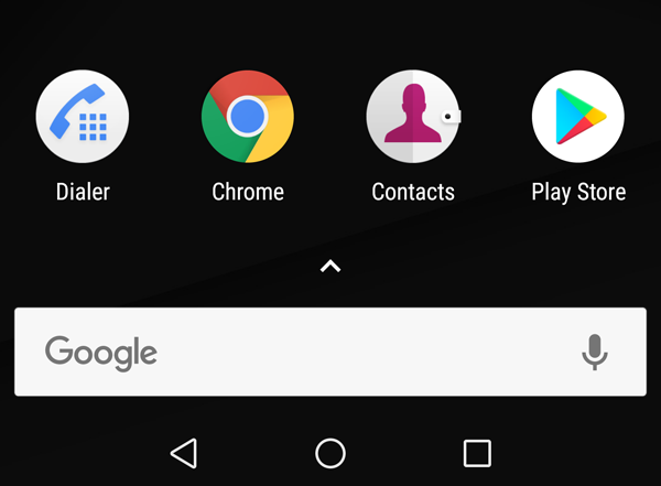
We will be using a launcher that most Android users already use, Nova Launcher. Now, repositioning the search bar towards the bottom is quite simple and isn’t something you would need Nova Launcher for. But there’s more to this look than simply placing the Google search bar in the dock. Because if you do that, the result is something like this :
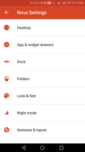
So here are the settings that you’ll need to tweak in order to get the new Pixel 2 look. You can access settings on Nova Launcher by long pressing an empty space on the home screen, just in case you didn’t know.
Oh and do place the search bar in the dock already before proceeding further.
Desktop settings
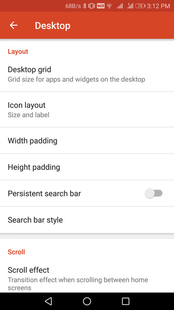
Once you open the Nova Settings, the first option here is Desktop. In the desktop settings, you can tweak the look of the search bar by going to Search bar style. Here, select the rounded search bar under Bar Style.
Scroll down and then under Logo Style select the colorful ‘G’ logo for the search bar. In the preview window, you can see that now you have a search bar like on the leaked Pixel 2 render.
Also read: 4 Awesome Icon Packs You’ll Love [#20]
As you’ve seen, moving the search bar to the dock is one thing, but on any traditional Android launcher, you can’t have two rows. Meaning the icons on your home screen cannot be in the dock if there’s a search (or any) widget in it. As of now, there is a page indicator between them and your search bar. So, remove the page indicator. You can find the Page indicator option by scrolling down in the desktop settings. Tap on it and select None.
Now go to Height padding and select Medium. This is the first part of ensuring that the space between the search bar in the dock and icons isn’t off compared to the space between them in the renders.
App & widget drawer settings
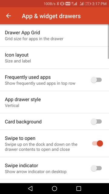
You’ve probably done this already when the original Google Pixel came out. But just in case you haven’t, here is how you can enable a Pixel-like app drawer. Go to Nova settings > App & widget drawer and turn on the toggle next to Swipe to open. Make sure the Swipe indicator option right below it is not turned on. We are now halfway toward getting the Pixel 2 look.
Dock settings
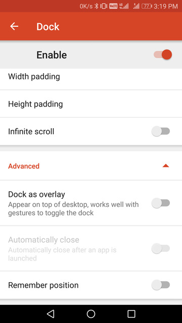
You’ll find the Dock settings right below the App & widget drawer. Tap on it and then scroll down all the way to the bottom on the next page. Tap on the Advanced option and toggle on the option that says Dock as overlay. This will make the dock overlap your home screen thus also eliminating any space between your search bar and your home screen icons. But hold on, don’t go back just yet. Go to Height padding in the Dock settings and select None. Similarly, select a Width padding of Medium. This will align the search bar with the rest of your home screen icons.
Homescreen setup
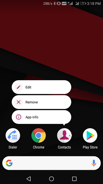
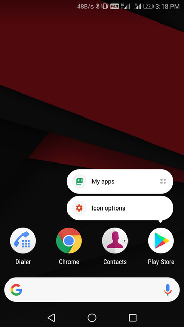
Now with all of that said and done, when you go to your home screen, you’ll find there is still something off about it. It’s the app names below the icons. Since the icons are on your home screen and not exactly in the dock. To remove the names, long press on an icon and select Edit. If the app supports app shortcuts, you may have to tap on Icon options first before you see the Edit option. Delete the name in the App label field.
Don’t miss: Easily Control Your Android with a Macbook Like Touchbar for Android
Alternatively, in the Nova settings, you can go to Desktop > Icons & Layout and disable App labels. But this would mean none of the apps on your home screen will have App labels, in case you add more than just one row of icons.
You can try different height padding settings if you’re not happy with the spacing between the dock and the nav bar or the dock and the icons. By now, you should have the Pixel 2 look on your Android device.
Recommended for you: Rootless Launcher in-Depth Review


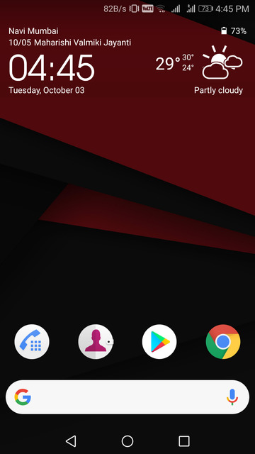

It’s missing the best part though, the date/calendar/weather widget…
try Another Widget https://play.google.com/store/apps/details?id=com.tommasoberlose.anotherwidget
Looks great, but I must be missing something?
My “persistent” search bar is just that! I cannot move it – it’s fixed to the top of the screen by Nova…
Go to desktop settings and you will find a toggle called “persistent search bar”, toggle it off and google search bar will disappear from your desktop. Add google widget manually and you’re good to go. https://uploads.disquscdn.com/images/082f5d87520930a9b0d7f24e2f58adc8e9259cea8c358a900ea893826bfc633b.png