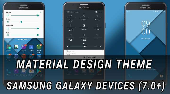
Search engine giant Google debuted the Material Design language for its Android OS user interface way back in late 2014 with the introduction of Android Lollipop (5.0). It was a radical departure from the Holo design language that was employed in pre-lollipop builds of Android, in the sense, that it brought with it a design based on paper and ink, employing white backgrounds and brighter colours, flatter, uncluttered and modern design (which now is seriously getting kinda stale and bit too long in the tooth) as opposed to Holo design that featured dark grey backgrounds and Tron: Legacy inspired blue accents throughout the UI. Speaking of Holo, it was considered gorgeous and futuristic at its time due to the fact that it itself was a radical departure from boring, unassuming and outdated designs before its debut.
Material design, again?
As of now, the Material design is still currently in use in Android 8.0 Oreo that debuted last year. Moreover, With Android P (Pancake, perhaps?) being a few months away, XDA Developers had reported a few days ago that the same would feature a revamped Material design UI with new colors and iconography. So it’s pretty much safe to assume that the next major version of Android would again employ the Material design for its user interface (Google, please, you better don’t, because let’s face it, Material design just doesn’t feel all that modern anymore, we all need something visually stunning for 2018). Well, that was my opinion, yours may vary.
Must Read: Get an AMOLED Friendly Theme on Samsung Devices
Theme: Material Design
Tired of Samsung’s infamous “TouchWiz” UI?, Oh sorry!, The “Experience” UI as it’s now called. By the way, who would forget TouchWiz?, once best known for its clunkiness, bloatware and a trillion gimmicky features and odd quirks (not that the current iteration is any less, but yeah, much better than before) that even tech enthusiasts hardly knew about. And if they knew, they either did not care or even knew how to use them in the first place. Speaking of which, one thing I really don’t get is, why can’t Samsung or to be fair, other OEMs who love to clutter Android with their clunky and heavy skins, just use stock Android with a few tweaks here and there (to differentiate themselves, à la OnePlus and Motorola)? Wouldn’t that be better? Let me know in the comments section below. Alright, now, let’s check out the Material design inspired theme for Samsung Galaxy devices running Android Nougat 7.0 or higher as depicted in the screenshots below.
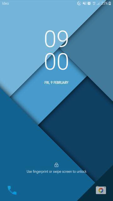
Lock screen
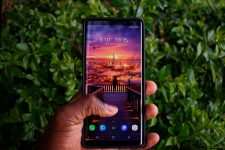
The lock screen features a Material design wallpaper compete with even the icons and fonts. With that said, now let’s move on to the home screen and beyond to get the real deal though.
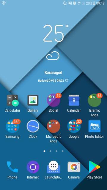
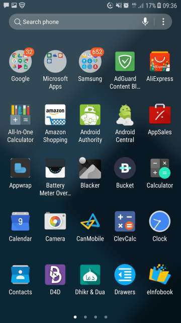
Home screen and app drawer
Get past the lock screen and you’ll notice the same material design wallpaper carried over to the home screen and app drawer. The icons are draped in material design. One superb attention to detail are the icons for the clock and calendar, that is they are dynamic or live, as in they keep track of the time and date in real-time rather than just being static (maybe this has to do something with the Samsung firmware).
Also, a few system icons aren’t themed (for example, the Game Launcher icon). Can’t complain because the developer has mentioned clearly in the description that the theme utilizes Material design guidelines wherever possible. Sweet!
Settings, dialer and notifications panel
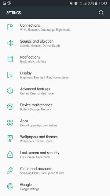
Much like stock Android, here too the settings page is white in color (also, notice the greenish grey bar at the top) complete with teal colored icons. However, the icons aren’t the ones used by Google, rather they are the stock Samsung icons itself accented in teal to give it a touch of stock Android. Looks great!
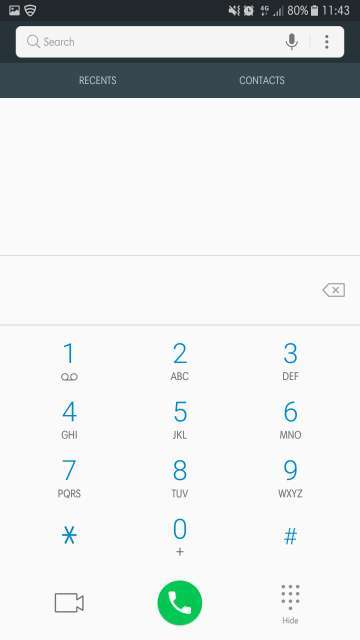
The dialer does its best to look and feel like stock Android complete with the background to the greenish grey bar at the top. Take a look at the call log below. It even does its best to look materialistic.
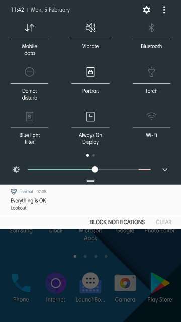
The notifications panel background along with the brightness slider is themed exactly like you would see on a stock Android phone (Nougat for that matter, as Oreo has a white background for the notifications panel) except that the icons here again are the stock Samsung ones itself but with a touch of material design (white in color).
Volume control panel
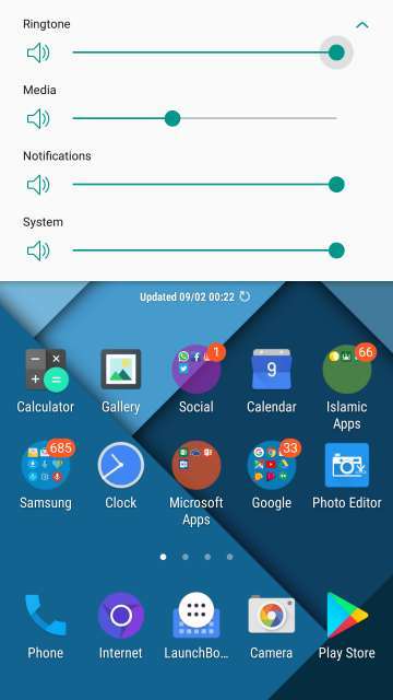
From the white color background to the green colored toggles, the volume control panel looks like the one that’s featured in Android 8.0 Oreo. Superb, clean and simple.
Do Not Miss: Download Samsung Galaxy S9 Leaked Stock Wallpaper
Keyboard (provided, you use the default Samsung keyboard)
The Samsung keyboard also gets the Material design treatment. Looks subtle and simple.
Download
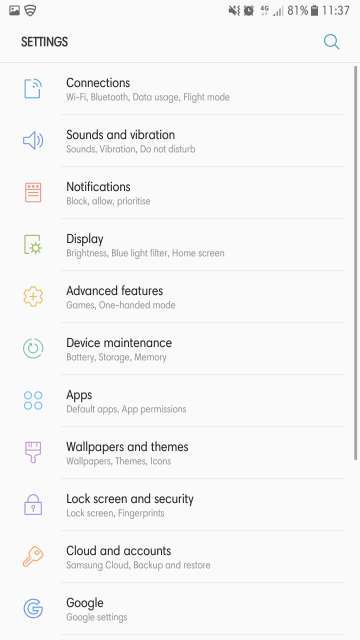
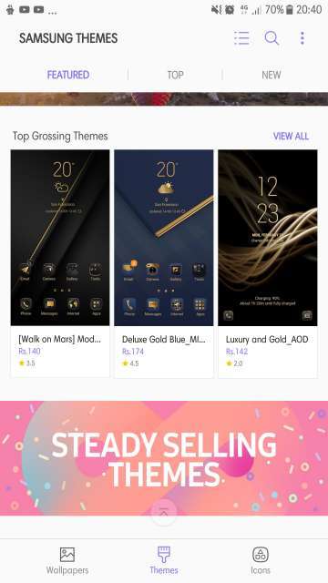
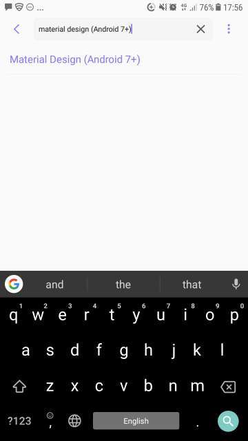
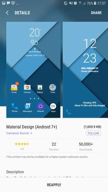
To download Material design theme, simply head into your device settings, then tap Wallpapers and themes. Next up, tap the Theme tab located at the bottom of the page. Locate the search bar and search for ‘Material design (Android 7+)’ and select it and press the Download button to well, download it and apply. Refer the screenshots below to learn more.
My thoughts and conclusion
So that’s the Material design theme for Samsung Galaxy devices onboard Android Nougat or higher. This theme is for those who love Google Material design, no matter what type of custom OEM skin their phone might have shipped with. Well, in actuality, this theme helps creates an awesome combination of both Experience UI and stock Android. Thanks to the developer, Cameron Bunch for such a clean and stock Android-esque theme.
And as always, feel free to chime in the comments section on your take and experience (well, only if you’re rocking a Samsung device running Android Nougat or higher) with this wonderful theme. Moreover, would you ever pick stock Android over Samsung’s Experience UI and why? Also, do you think it would be great from Samsung’s part to switch to stock Android UI for their future flagships (at least), mid-range and low-end devices? Sound off in the comments section below with your opinions and answers to the questions I just asked to let me know. Happy theming, all Samsung Galaxy users!
Also Read: Enjoy Awesome Dark and AMOLED Wallpapers with Blacker




Join The Discussion: