Even though the third developer preview of Android O has been out for a while, the next version of Android doesn’t yet have an official name. What is does have are plenty of new and cool features that you’d wish you had on your phone. The OS update isn’t coming out officially until Q3 2017 but thanks to the devs, we have access to some of the updated stock Android O apps. We’ve previously seen how to get the updated Pixel Launcher from the Android O developer preview. Now, we can get the Android O Clock and Camera apps on any Android.
XDA dev krisyarno pulled these updated apps from the latest dev preview of Android O, that is the third one. The APK packages can be easily installed like any normal APK and do not require root. Not much has changed in these updated APKs compared to the apps already out on Android Nougat. Also, note that the apps might not be compatible if your device isn’t a Nexus or a Pixel running Android 7.1 Nougat. The Clock app has more chance of compatibility with other devices compared to the camera app.
Download Android O Clock and Camera apps
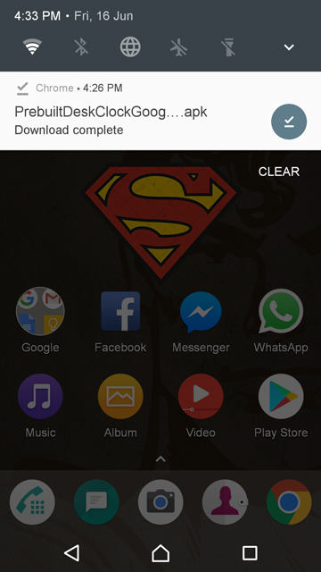
Download the APKs from the download links below. When downloaded, just tap on the notification to get to the installation screen. Tap install and the apps should install without any hiccup. You will need to have Unknown sources enabled in the settings. This can be found in Settings > Security.
Don’t Miss: Turn Selfies into Emojis with These Apps
Enjoy the updated apps
The only difference between the old clock and the new clock is that of color. The earlier version was blue, that turned into a darker shade in the night. The new version on the other hand is just a darker shade of grey, or you could call it a material dark shade. This is not a dynamic color like the previous one, so it doesn’t change according to the time of the day. I’m not sure if you’d call this an upgrade but it is what it is.
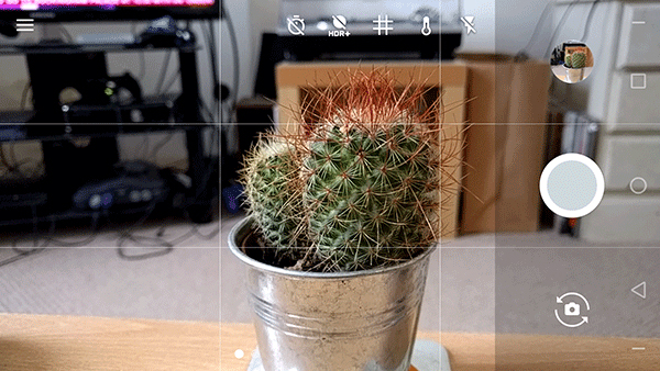
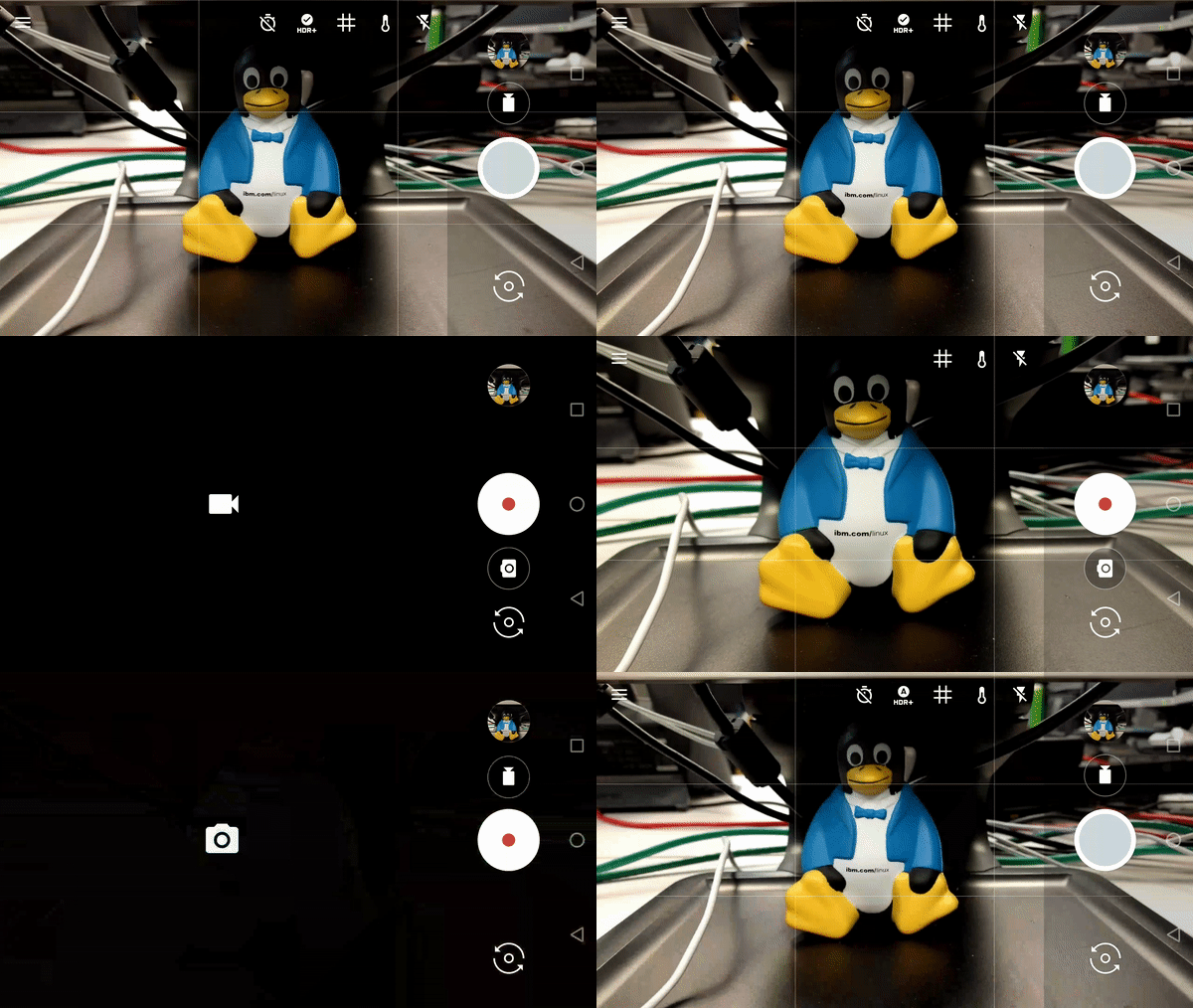
The Camera app, similarly, isn’t much different in terms of functionality either except a small change. You could previously switch between camera and video recording modes with a simple swipe in the earlier versions of the stock camera app. In the updated version this is more obvious with visible buttons on the camera interface. The swipe to switch modes still works if that’s how you prefer it. The icons appear on either side of the shutter button depending on which mode you’re in. Other than that, if you look really close, the size of the inner grey circle on the camera shutter button is also slightly different. Not that it is a change worth noticing. But when there aren’t any significant changes, you tend to notice the little ones.


Join The Discussion: