One of the most useful features of the Chrome browser is the Autofill feature. When you tap on any address, password or log in fields, the autofill features pop-up. Just select the required option from the autofill feature and will then get automatically populated over to the webpage. It saves quite a lot of time and effort entering these details every time manually. And now, the Chrome browser has received a major overhaul and incorporated a new Autofill UI. Let’s see how to enable this new UI in the addresses, payment cards, and passwords field.
Enable Chrome’s New Autofill UI
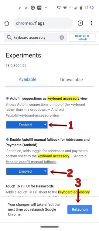
If you are among the users who use Chrome Canary or Dev, then the feature should have been live by now. However, if you only prefer to use the stable Chrome browser, then there is a way of enabling this new autofill UI. For this, you have to take the help of Chrome’s experimental features, i.e. flags. Head over to your Chrome browser’s address bar and type chrome://flags. And enable the below two flags:
- In the search bar, enter #autofill-keyboard-accessory-view. Entering this in Chrome will enable the new autofill UI for Passwords.
- Next, enter #enable-autofill-manual-fallback. This enables Chrome’s new autofill UI for card payments and addresses.
Make sure to relaunch Chrome once after enabling the above two flags. Once done, refer to the below section to know more about Chrome’s new Autofill UI. However, to enable password leak detection in Chrome 78 and force dark mode, refer to our guide on the same.
Passwords, Payment Cards, and Address Field
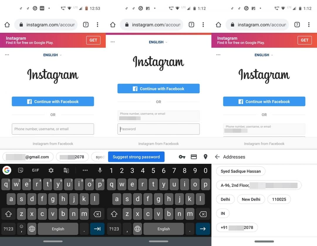
When you tap on the login credentials field, you would no longer get the autofill suggestions inside the rectangular box. All this will now be moved on top of your keyword in circles. Simply scroll to the left and select the desired credentials. This is applicable to all the three- passwords, credit/debit cards, and address fields. Furthermore, if you enter a login ID that isn’t saved in your Google ID, you will also be notified to enter a strong password.
On the right of the autofill section, you will now see three new icons. The first one is the Show Passwords key. Next is the Show payment methods card and the last one is the Show address GPS icon. So these were Chrome’s new Autofill UI. Apart from that, you could enable another flag to and give your password section another overhaul. Refer to the below section for more.
Chrome’s New “Touch to Fill for Passwords” UI
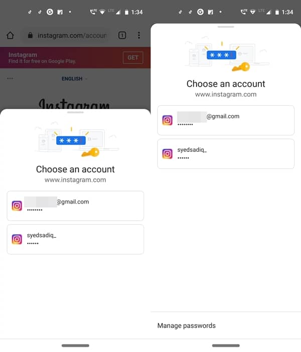
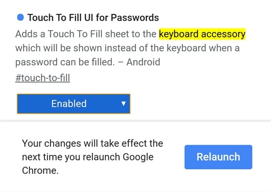
While enabling the flags for Chrome’s new Autofill UI, you might have noticed a third flag that we didn’t enable at that point in time. Well if you go ahead and enable the said, i.e. #touch-to-fill flag, then this is what will happen. On tapping the username field of any website, an overlay will now appear from the bottom from the screen, along with the required credentials. You can further expand this overlay by swiping it upwards. Do note that although this Chrome flag for enabling the new autofill UI for passwords is visible in the stable version, yet it isn’t working as of now. To see what it actually does, you will have to enable this flag in Chrome Canary or Dev version.
So these were all about Chrome’s new UI for the Autofill section. Although not much of a game-changer, yet the new UI is definitely a welcome change and looks much better than the initial one. What do you think? let us know your views in the comments section below. Moreover, these flags are yet to make it’s way over to the desktop version of Chrome. Once it does, you will be first to know. Until then, stick with us.


Join The Discussion: