Mozilla has been trying to sell people on the idea of privacy for a long time now. Not only has it been unable to, but it has also actually lost market share to Google Chrome. Brave Browser tries a different approach towards the same goal. It was pioneered by Mozilla co-founder and JavaScript inventor Brendan Eich several years ago and it has finally made it out of beta. Brave Browser 1.0 is here now, so a Brave Browser vs Chrome showdown seems appropriate. You should also check out our detailed Brave Browser review to learn about all its pros and cons.
Google Chrome vs Brave Browser
Some browsers have tried playing the privacy angle before such as Firefox and even Opera. They feature built-in ad-blocking, but still, people use Chrome which doesn’t do any of those things unless you install extensions. Brave has a built-in ad-blocker too but this is where Brave really stands out.
Instead of blocking ads and impacting revenue to websites, Brave gives users Brave Attention Tokens or BATs. If you turn on Brave Ads, you get 70% of the revenue as BATs. So you’re getting paid for watching ads, not publishers. You can’t exchange these points for actual currency but donate them to your favorite publishers. Not only does this make sure the publishers get paid for their work, but it also puts the users in control of who gets paid, rather than who shows more ads.
The easiest way to understand this is by using your imagination. Imagine a world where Brave, not Chrome, was the dominant browser. Most websites that now show annoying ads would instead focus on quality content. After all, you’re the one they need to impress. It’s a great idea but we can only wait and see how far it can go.
Interface
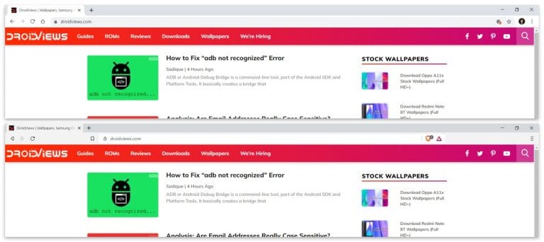
Brave Browser is based on Chrome’s open-source sibling, the Chromium browser. There aren’t many browsers these days, except Firefox and Apple-limited Safari, that aren’t based on Chromium. Unlike Opera or Vivaldi though, Brave keeps the interface pretty close to Google Chrome itself. There are wide open spaces on both sides of the URL bar, a bit like Mozilla Firefox has by default. Both browsers do allow the option to remove these spaces and extend the address bar wider.

While the interface is similar, Brace does just enough to differentiate itself like changing a few icons, most notably the menu button icon. There are a couple of extra icons here as well which are for Brave Shields and Brave Rewards which we’ll get to. Overall, Chrome still looks a lot simpler and works for most people out of the box. People like me can’t just ignore all that empty space around the address bar and will need to go to the Settings to remove it. Even if we ignore hat, the Brave shields and rewards icons also don’t really match the overall aesthetic of the browser and look like some third-party extension.

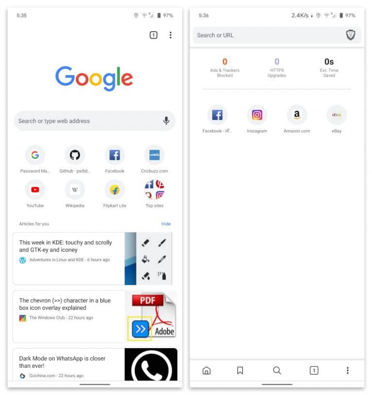
On mobile, there are more noticeable differences between the two. While Chrome is all curvy Brave maintains its boxy look. Which is better is a personal preference but right off the bat, Brave on mobile just presents a better interface. The reason is that it moves all the necessary control buttons to the bottom which is really nice when all smartphones have huge displays. Sure it is possible in Chrome via flags, but how many people even know about Chrome flags?
Don’t Miss: How to Find Out Malicious Browser Extensions
Features

Both Chrome and Brave are based on the same open-source Chromium project. These days the browser wars are not about features really. Almost everything you can get on Chrome is available on any other Chromium-based browser, Brave included. That’s because all Chrome extensions are available for Brave as well. But like Vivaldi and Opera differentiate themselves by offering more customization, or a helpful sidebar, Brave bets on privacy.
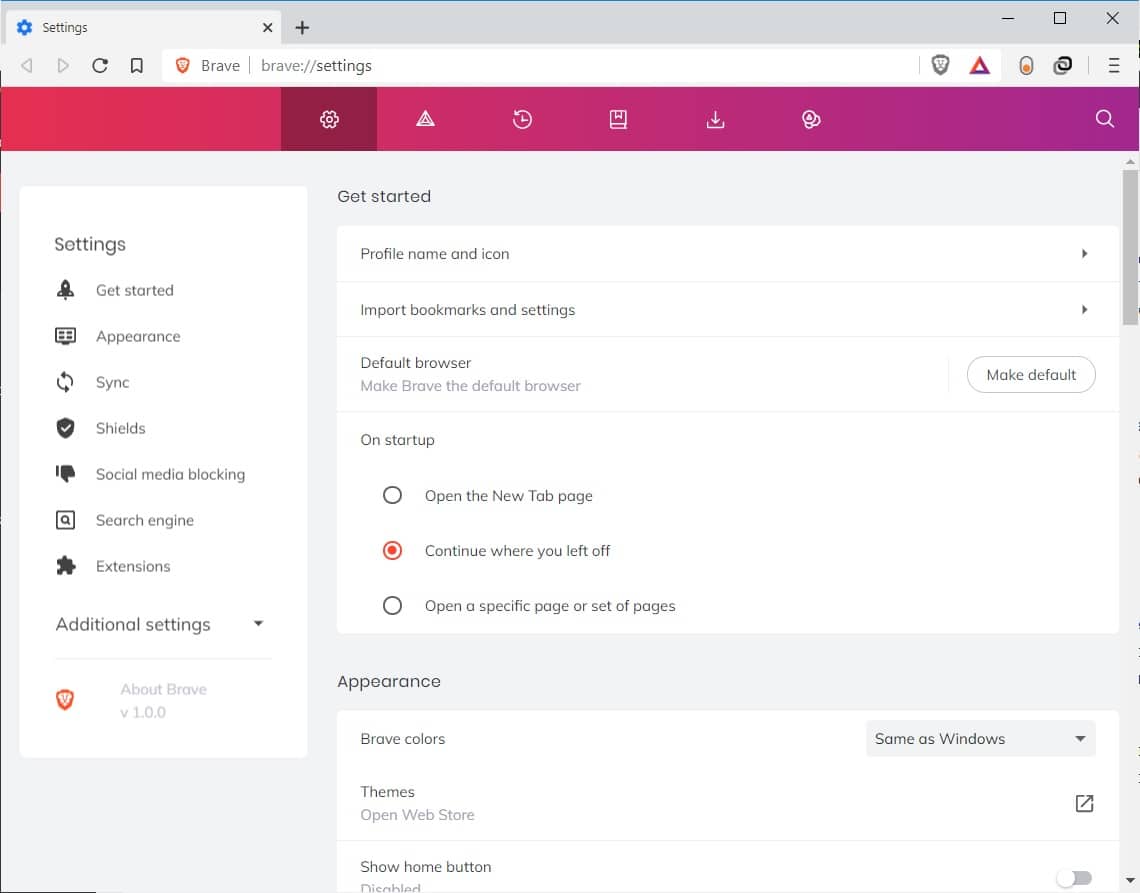
The Brave Shields feature blocks most invasive ads, trackers, cookies, scripts, and even autoplay videos right away without the need for an extension. It also supports HTTPS Everywhere which is something you need an extension for in Chrome. There is a dark mode that you can manually toggle or let it change according to your system theme.
Performance
Performance is where Brave obliterates Chrome and any other browser really. The difference is so significant that we don’t need to do any extensive scientific testings at all. In fact, just install Brave Browser right now and you can notice it without even trying to. If you do want numbers, Brave is approximately 3 to 6 times faster than your favorite web browser, including Chrome.
Of course, when the browser blocks all the annoying popups and ads the speed has to improve. But more than that it is the experience. We’ve all seen annoying popups about a website being transparent about using cookies, or scripts, etc. With Brave, you get none of that and head straight to the content you are interested in.
Google Chrome vs Brave Browser: Should you switch?
Brave looks a lot like Chrome but still different. It’s a whole lot faster and makes browsing the internet feel like an enjoyable experience, especially on mobile. It still has access to the huge library of Google Chrome extensions while incorporating features from the most popular one right into the browser. To top it all, Brave doesn’t even require you to create an account to sync your data across devices. Frankly, the only logical reason I can think of to stick with Chrome is that I like the Google Chrome icon and I don’t like the Brave Browser icon. That and change, because people usually don’t like it.
Read Next: Manage YouTube Playback Controls in Chrome


Join The Discussion: