It looks like Microsoft now understands the importance of cross-platform development and is trying really hard to embrace both Android and iOS with some quality apps. It has already made available its flagship services like Word, Excel, Powerpoint, Cortana, etc. Other than that it has also developed apps like Next Lock Screen, Hyperlapse, Parchi, Office Lens, etc.
Recently, Microsoft has introduced another app called Arrow Launcher. With this app, Microsoft has tried to redesign the way we use our smart phones. In late July, Microsoft unveiled Arrow Launcher in a Google+ group where it was available for beta testers. However, a few days back it finally introduced the official or final version of Arrow Launcher in Google Play Store and this time it’s bug-free and ready for public use.
Upon launching it for the first time, you’ll be asked to select your most used apps. This data is used to organize your apps in a way that your most used apps are always accessible to you with ease.
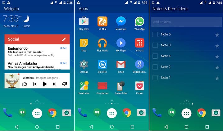
Arrow Launcher divides your home screen in 5 pages, the middle one being the main page with your most used apps. The way these apps are organized depends on your usage so the order of organization may change over time. Other pages include a contacts page that shows your contacts history, a recents page that shows all your recently used apps, videos, photos, and contacts. Another page manages your widgets. This widget page can also be further divided vertically i.e. you can have multiple widgets pages in a single panel. And another page works as a notes and reminders alternative i.e. in this page you can add all your notes and reminders without using any third-party apps.
The vertical app drawer contains all your apps in alphabetical order. It also shows recent apps on the top and has a separate page for widgets.
Swiping up from the bottom of the home screen opens up a panel that looks similar to the control center in iOS. It works as an extension of dock and contains few apps and shortcuts like airplane mode, WiFi, torch, bluetooth, and auto rotation. From that same panel, you can access apps settings as well as arrange the home screen pages.
It also comes with a set of landscape wallpapers that are provided by Bing. A feature that changes your wallpaper on a daily basis can also be enabled from app settings.
So that’s Arrow Launcher. It’s quite new and feels really smooth. The way it arranges your most used apps looks kind of similar to Aviate Launcher by Yahoo, but that doesn’t matter much at this point as it offers multiple useful features and works effectively and efficiently. I can easily recommend Arrow Launcher to someone who is feeling like taking a break from popular home replacement apps like Apex and Nova.
[googleplay url=”https://play.google.com/store/apps/details?id=com.microsoft.launcher&hl=en”/]


Join The Discussion: