The first Android P Developer Preview was released a couple of months ago. It introduced a number of changes, many of them visible outright in the interface. At Google I/O 2018, the Mountain View-based company released the Android P Developer Preview 2 for enrolled Google Pixel devices. What makes this release significant is that this is the first Android P beta build. This means that if you’re enrolled in the Android beta program, you can easily install this via an OTA update. It has been almost two months since the first developer preview of Android P launched. Therefore, this new Android P beta does bring in many changes over the previous preview. Android Oreo was more about the internal changes but Android P is full of changes that will directly affect the user experience.
What’s new?
Project Treble, introduced with Android Oreo, shows its advantages already now making the Android P beta available for more than just Pixel devices. If you have a Project Treble supported device, you can enroll in the beta too. These devices include the Essential PH-1, Nokia 7 Plus, OnePlus 6, Oppo R15 Pro, Sony Xperia XZ2, Vivo X21, Vivo X21 UD, and Xiaomi Mi Mix 2S. So that’s new, for one, but there’s a lot more that’s new.
Adaptive Battery
One of the new changes introduced is the Adaptive Battery. Android P will use AI and on-device machine learning tech from DeepMind to determine your usage pattern. This will help the latest and greatest version of Android prioritize battery power for the apps and services you use the most. The apps are divided into four categories, ‘active, frequent, rare, and working set’. Google says this will result in up to 30% reduction in app wake ups.
App usage dashboard
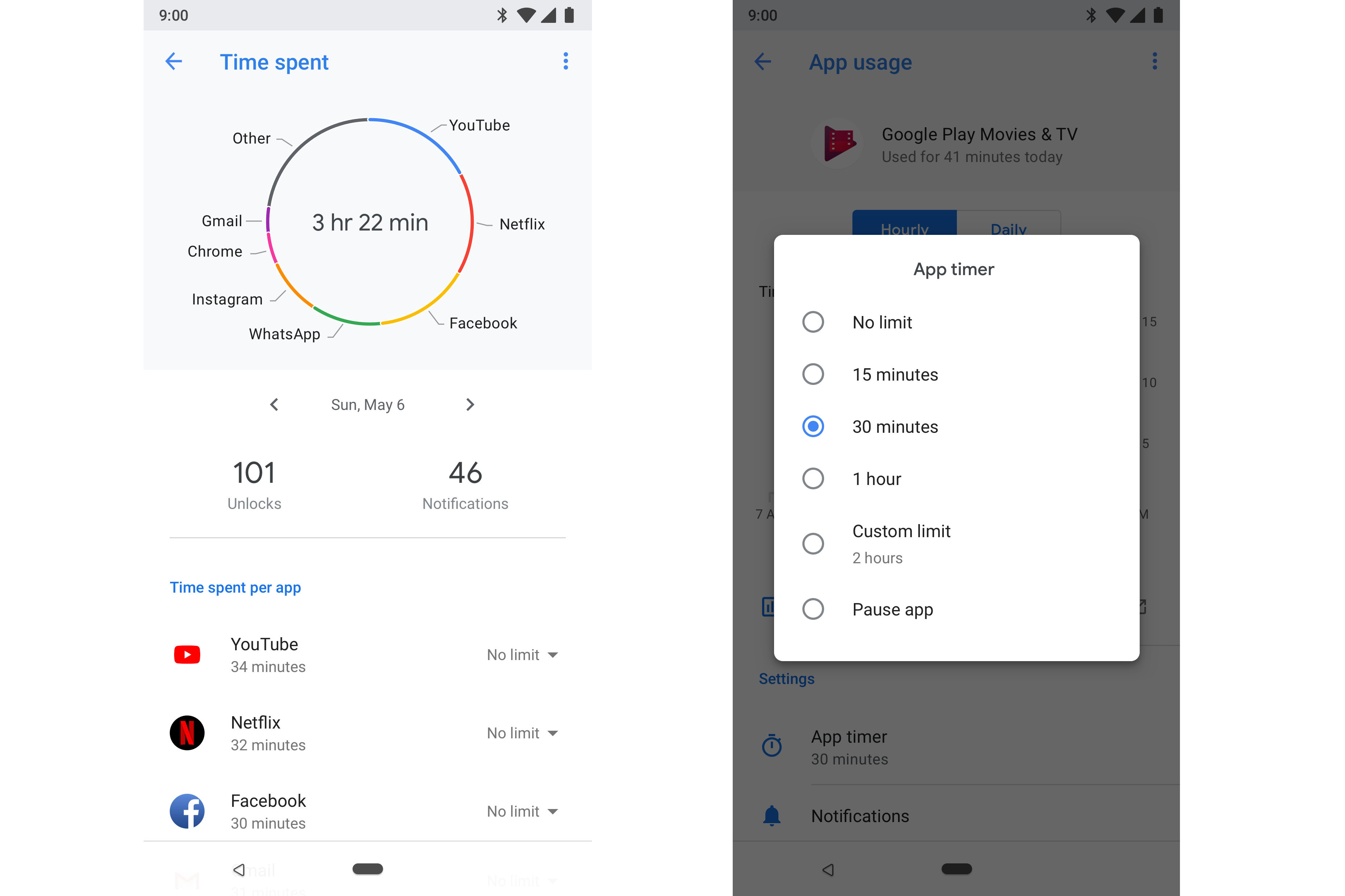
Since we are talking about features that make use of your app usage habits, let’s talk about your app usage habits. Android P will have a new dashboard where you can see how often, when, and for how long you are using the apps on your phone. We’ve all seen articles stating how the presence of social media apps on our smartphones is affecting us negatively. ”There are 2 billion Android users. It’s the largest mobile operating system in the world,” Sameer Samat, VP of product management for Android said, adding, “We are the OS, and we feel like we need to be doing more around this area. We feel like we have a responsibility to do more.”
You may also like: How to Uninstall System Apps or OEM Bloatware without Root
The dashboard also allows you to set up the number of minutes you are allowed to use each app in order to limit yourself from basically living on Snapchat. When you’re about to reach your usage limit, a notification will tell you so. After this, the app will be “paused” and you’d be locked out of it. Think of it as a self-imposed parental control. The app icon is then grayed out in the app drawer and tapping it only tells you that you’ve used up all your allowed time. You can always unpause it but you’d have to go all the way to the dashboard again in the Settings. That can be just the discouragement one needs.
Adaptive Brightness
Another feature that should improve user experience is Adaptive Brightness. Some of you might think that this is already available on smartphones since forever. However, Android P’s Adaptive Brightness is different. Where automatic brightness does the job somewhat, it still leaves many users manually adjusting the brightness often. That completely negates the purpose of its existence. This is because not everyone prefers the brightness automatically set by their phone depending on the ambient light. For instance, I prefer a slightly brighter display than stock Android generally thinks I want in artificial lighting. Adaptive Brightness introduces AI into the ambient brightness setting. It learns the user preferences and environmental conditions to provide a more optimal brightness level automatically.
Navigation gestures
Don’t miss: Android P Developer Preview 2 Stock Wallpaper | Android P Beta Pixel Launcher Port
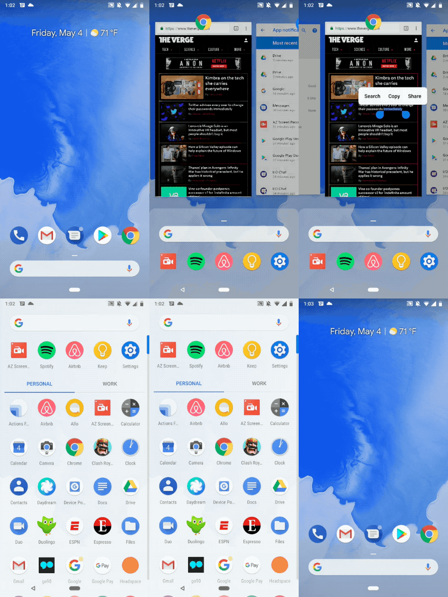
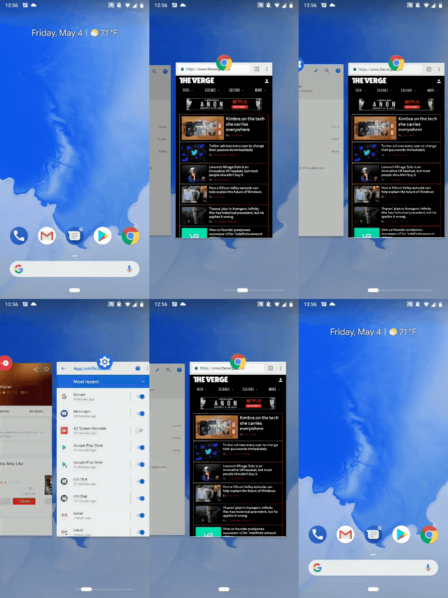
If you thought Apple was kidding when they called the iPhone X the future of smartphones, well, think again. We’ve already witnessed the attack of the notch, with Android P bringing official support for it. Now, the other iPhone X feature, navigation gestures, are included in Android P as well. A swipe up on the home button to bring up a newly-designed Overview (iOS-like), which shows users full-screen previews of recently used apps. You can actually copy and paste stuff between different apps this way without switching to one in particular. To access your most recent apps simply consider the home button a scrollbar. That is, drag it towards the right.
Swipe up longer and you can access your app drawer. This effectively kills the need for a square recent apps button. The back button is only available when you have an app open. This leaves you with just a narrow, pill-shaped home button at the bottom of your home screen.
App actions and slices
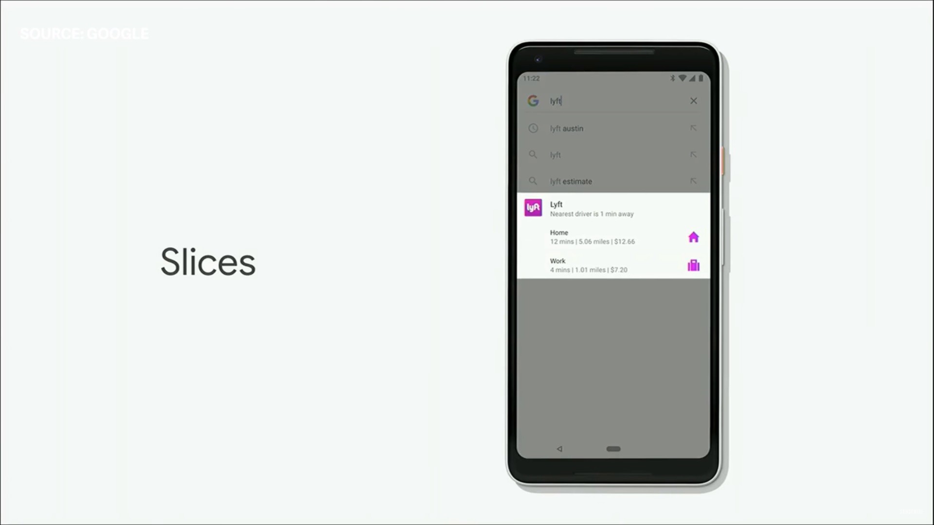
Google has been betting big on AI for quite some time now and Android P seems to be where it all becomes a reality. Both App actions and Slices, in a nutshell, are deep actions that you would normally find inside apps, visible around on the interface of your OS, in different parts. App actions can appear anywhere in places like the Launcher, Smart Text Selection, the Play Store, the Google Search app, and the Assistant. Slices are a part of these app actions. Google gives the example of searching for Lyft using the Google search widget on your home screen. This can show you a slice of the Lyft app allowing you to directly select where you want to go and book the cab right away.


Join The Discussion: