While most Android users patiently wait for their device manufacturers to push out Android 8.0 Oreo updates, Android 8.1 is already out for testing. Google announced the availability of Android 8.1 as a developer preview 8 days ago. Exactly 8 days later, owners of the Google Pixel, Pixel XL, Pixel 2, Pixel 2 XL, Nexus 5X and Nexus 6P can download and install it. The update might seem pretty small but it packs in a lot more changes than meet the eye. There are some minor visual changes as well as a number of behind the scenes improvements. So here’s what’s all new with the Android 8.1 Oreo Developer Preview 1.
New Easter Egg
(Image credits: /u/adrianj93)
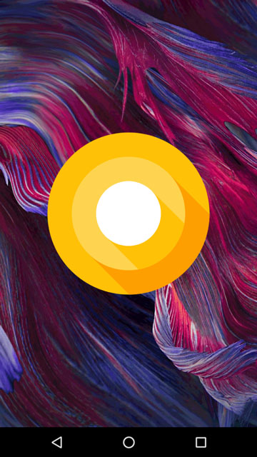
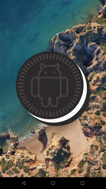
This will be a nice change for easter egg lovers. Android 8.1 now displays an Oreo cookie with the Android bugdroid instead of the known “O” icon. You can access the easter egg by tapping the Android version in About phone 7 times. If you repeatedly tap on the easter egg, which is now an Oreo cookie, you can still access the Octopus easter egg which was introduced in Android 8.0 DP4, but there’s no new Oreo-themed game.
Revamped Settings
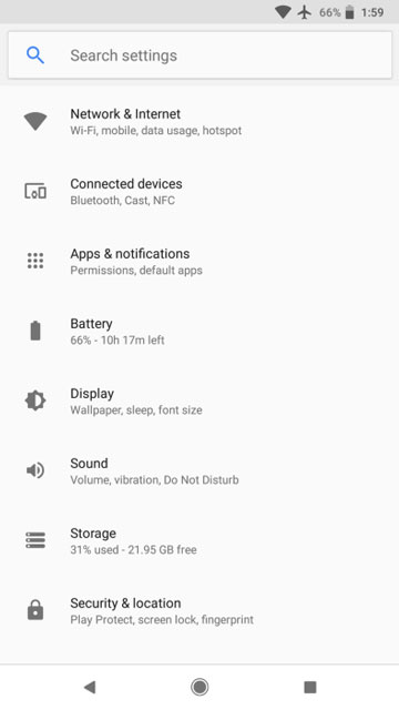
(Image credits: 9to5Google.com)
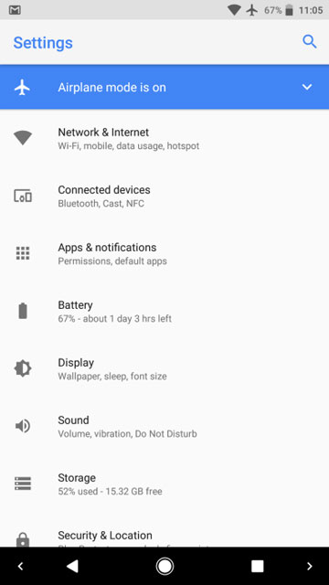
Well, to get to the easter egg you’re going to go through Settings. And if you did go to the Settings app on the Android 8.1 Developer Preview 1 you’d be surprised. The Settings app, which received quite a few changes in Android 8.0 Oreo, has yet again received more changes in Android 8.1 Developer Preview 1. The search icon that used to sit in the right corner on the toolbar now takes up the central role and fills up the entire space. The small icon in the top-right could easily be overlooked by people not used to it but with the new search bar, the search function is more prominent and eye-catching.
There are some other minor cosmetic/layout changes as well and the Settings app should now feel closer to that on the Pixel 2 and Pixel 2 XL. The navigation bar also adapts a white background and dark icons when the settings app is open.
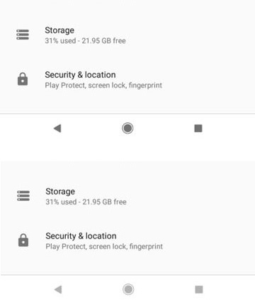
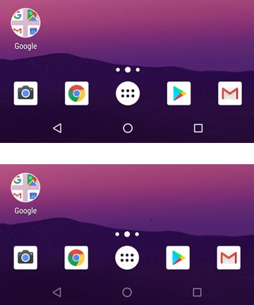
Navigation bar dims when inactive
Apart from changing the background and foreground colors, the navigation bar in Android 8.1 actually dims when no touch input is detected after several seconds. The “Auto-dimming” works system-wide as you can see in the screenshots above, regardless of the color of the navbar at that moment. This could be a preventive measure for the burn-in issues on devices with an OLED panel. Furthermore, the navigation bar icons are now noticeably smaller, and closer together compared to the navigation bar on previous Android versions.
Light and Dark System UI
Lovers of the dark side, your prayers have finally been answered. Not many people were a fan of Material design thanks to the white background used everywhere. It is not hard to imagine that those people were not very big fans of the Android Oreo UI changes. The Settings app turned completely white and so did the quick settings. We knew Google had been working on a dark theme but it never really took shape in two years. It finally makes an appearance again on the first Android 8.1 developer preview.
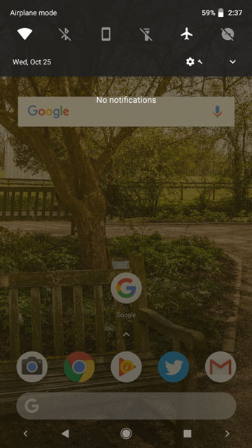
Image credits: @technacity
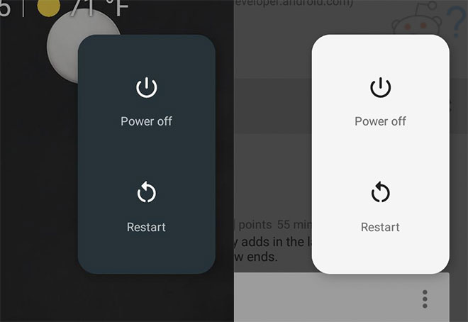
But Google is not simply giving you a flip switch to turn on or off a dark or light theme. It’s Google, and they’d like to guess it before you know it. So they give us an adaptive System UI which now takes advantage of the newly introduced WallpaperColors API (API 27) and extracts the colors off your wallpaper. Depending on whether your wallpaper is dark or light, the System UI changes to a dark or light background respectively. This includes the quick settings panel, volume sliders, power menu, mini QS/notification shade, and even the app drawer and folder/shortcut background on Pixel Launcher.
Although, before you jump in joy, this happens only as long as the wallpaper is visible. Meaning if you’re using, say, the twitter app and you pull down the quick settings, it will still be white and bright as before. If you’re using an app that uses your wallpaper as the background then the quick settings will again turn dark (or light, depending on your wallpaper).
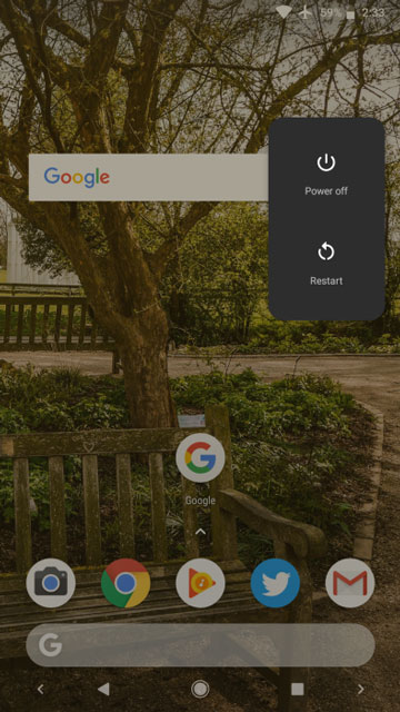
Power menu is no more at the center of the screen
Image credits: /u/JediBurrell
On the Pixel 2 and Pixel 2 XL, if you long press the Power button, the Power menu does not open up at the dead center of the screen. Instead, you get a redesigned, way smaller, more user friendly menu to a side of the screen, aligned with the power button. This facilitates one hand usage since your thumb can easily reach where it already is. Android 8.1 brings this new power menu to other devices (well, older Pixel and newer Nexus devices).
Other Changes
There are also some other minor changes and improvements that are less noticeable.
- Toast-notifications are also, now white.
- The status bar has more padding on the right and left making it more friendly for devices with rounded corners. Current devices with rounded-corners like the Galaxy S8, Note 8 and Pixel XL already have a similar padding in their status bar.
- Moving on with changes that bring Android 8.1 closer to the Android 8.0 on Pixel 2, users now get a colored notification if they skip the initial set up.
- The date under the Ambient display clock is back again.
- Long-pressing on a notification produces a vibration now.
- Android 8.1 now displays a battery bar for connected Bluetooth devices in the Quick settings.
- “Running in the background” notification is now “X apps are using battery” with X being the number of apps. Both this, and the “Drawing over other apps” notifications can now be disabled by the user just like any other notification.
- Like on Sony Xperia devices, users will now receive a dialog warning before turning off mobile data.
Downloads
Users enrolled in the Android Beta Program will receive Android 8.1 as an OTA update on their devices. If not, we’ve provided the links for the OTA files that you can download to your device.
Android 8.1 Oreo factory images can be downloaded from the links provided below and installed via ADB. If you’ve never installed factory images before, you can check out this guide for flashing a factory image to the Google Pixel XL. The process is pretty much the same for all Pixel and Nexus devices.
Android 8.1 Oreo factory images:
Android 8.1 Oreo OTA files:
Join The Discussion: