Launchers A.K.A home replacement apps are one of the most used and loved categories of Android apps. The unlimited amount of customization that Android has to offer is what sets it apart from other mobile operating systems. You don’t need to root your smartphones and install custom ROMs to customize them anymore. Basic customization can be easily done with the help of launchers, wallpapers, and icon packs.
Oddly enough, last year when I wrote an article regarding which Android launcher is the best depending on your needs, I didn’t even include Action Launcher 3 in the list. However now, after using it for a month, I have come to the conclusion that Action Launcher 3 is the best Android launcher EVER (Nova launcher lovers please don’t go bazooka on me). I like Action Launcher 3 as it meets my requirements in a way that no other launcher can. Here’s why it is a super awesome launcher and you should definitely try it if you haven’t yet.
1. Quicktheme
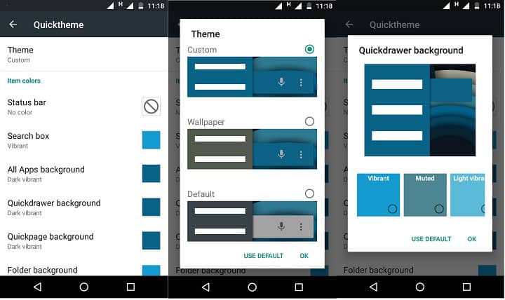
I’ll start the list with one of the most exciting feature of Action Launcher 3 – quicktheme. If you get easily bored by seeing the same colors on your phone every day then you’ll love this feature. Quicktheme grabs or extract the colors from your wallpaper and applies them all over the UI. What I mean to say is that your UI changes color every time you change the wallpaper. Use it with live wallpapers like Muzei or Chrooma and you’ll get a different feel every time you use your phone.
2. Quickbar
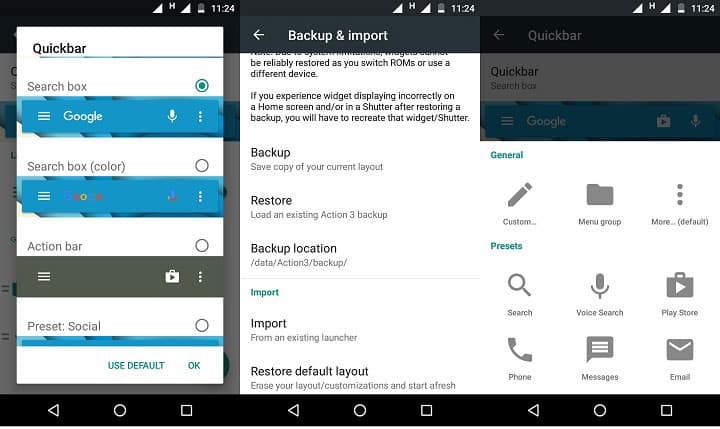
Via this feature you can add apps in Google search bar on your home screen. It is a great way to keep the home screen clean and save some space. I have added apps to Google play store and voice search only as adding too many apps there makes it look cumbersome. Kudos to Chris for coming up with this idea.
3. Quickdrawer
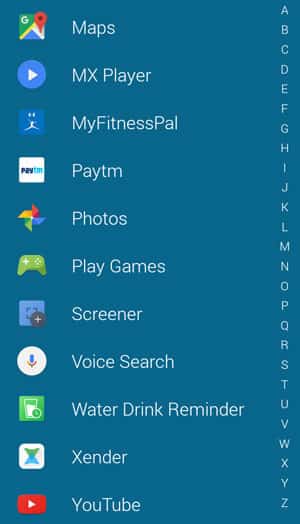
Quickdrawer is a Windows phone style replacement for app drawer. Although it has the standard app drawer too, but quickdrawer is way better and faster than it. You have the options to arrange apps via name, most used, or installation time. It also has the standard drag and drop feature for adding apps to home screen along with the ability to hide apps from the drawer which is probably one of the must have feature for any Android launcher.
4. Quickpage
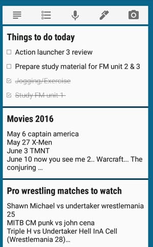
Quickpage is another feature of AL3 that I rely on a lot. It is like a space allotted to your apps and widgets separate from the app drawer, quickdrawer, and home screen. It is accessible from a swipe from the right edge of the screen. I keep Google Keep widget there so that I can look at my to-do list at a glance.
5. Shutters
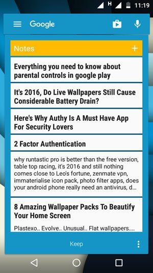
I like my home screen as clean as I can possibly make it. That’s why I just have four icons there. I like to use widgets too but they don’t really go with my clean, minimal look and make the home screen look very busy. That’s why I like shutters. What shutter does is hide a widget behind an app so it is not visible on the home screen. But it is accessible by an upward swipe on the said icon. Let’s take an example of Google Keep. This is what happens when I assign shutter to Google Keep – tap on the icon to open the app, swipe up on the icon to open the widget. Once you are done with the widget tap anywhere on the screen and it will hide behind the app again.
6. Covers
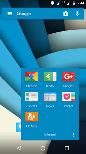
Covers are a lot like shutters but they deal with folders instead of widgets. Tap on the icon to open that particular app, swipe upward on it to open the folder.
7. Quickedit
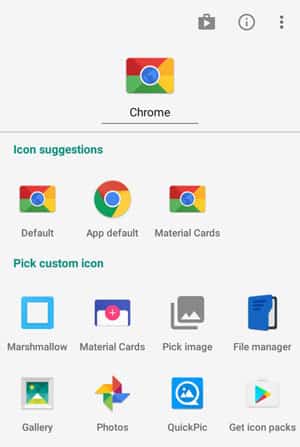
Quickedit is a new feature that gives you the option to edit icons on the home screen from a home screen. Long press an icon and a menu will appear with options like quickly uninstalling the app, editing its label, and app information. But that’s not what I like about Quickedit. What I do like is the option to quickly change the icon (again, from the home screen). The menu that appears after long pressing an icon suggests icons for that app by pulling appropriate icons from installed icon packs. What this mean is that you don’t have to open the icon pack app and go through the long list of icons ever again.
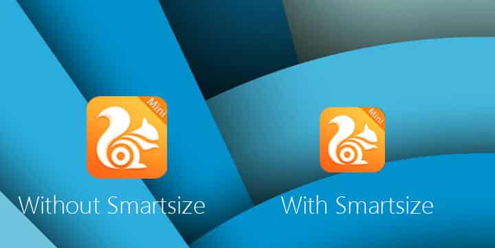
8. Smartsize
Some developers, I don’t know why, keep the size of their icon bigger than other icons. Having both small and big icons on the home screen reduces the looks of it. Smartsize automatically resizes icons to fit the material design grid. Hence, no more icons of different sizes.
9. Shortcuts & Gestures
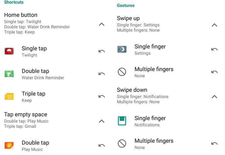
Shortcuts & Gestures are super essential for me. If a launcher does not have these features then I am not going to use it, but almost all launchers support gestures so there is no complaining.
Action launcher 3 provides some useful gestures and shortcuts like swipe up, swipe down, double tap, triple tap, swipe up and down with two fingers, pinch in, and pinch out. As for shortcuts, different apps can be assigned to one, two, and three taps on the home button. It only works on home screen.
10. Customization
Ah, customization! The biggest reason I use third-party launcher instead of the stock launcher. Action Launcher 3 provides a lot of customization option. For starters, you can hide unnecessary icons from the app drawer, apply icon packs, change colors of the most significant part of the UI (quickbar, quickpage, quickdrawer, and app drawer), different styles for Google search bar, and much more.
It also provides bundled Google Calendar icons that display the correct day for each day of the month, a bundled Marshmallow icon pack, Marshmallow animation and permission system, and option to backup your setup or import your setup from any other launcher.
I guess when I say Action Launcher 3 is the best thing that ever happened to Android, some of you will agree (and some of you won’t). In the end, it is all about personal preference.
[googleplay url=”https://play.google.com/store/apps/details?id=com.actionlauncher.playstore&hl=en”/]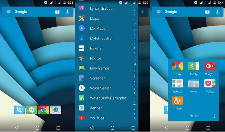




Join The Discussion: