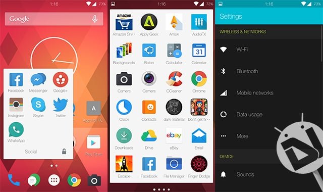
There are two types of Android users – The Stock Android users, and the people who use Cyanogen-based ROMs on their devices. To be quite frank, I’ve been a user of a lot of skins based off of Android, namely, TouchWiz, Xperia’s Timeline-UI, Stock Android, and many more. Amongst all of these fascinating UIs, I found that Cyanogen suited my needs the best. So, I did quite some research and found that more than 50 Million people use it as a daily driver.
So, I switched to my OnePlus One, and me including tens and hundreds of other people love the new CyanogenMod 12 ROM, which is based on Stock Android, 5.0. One of the key features of Cyanogen-based ROMs is their ability to spruce up your device with the ability to change themes. With the Google Play Store now filled with tons of themes, we’ve been able to gather some of the best ones.
Material Glass
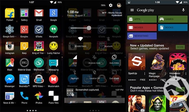
Blandly what it says, a glass theme to revise the total look of your Android device. Unlike any other theme, Material Glass provides you with a clean and refreshed UI, with no specific color accent. Some people (including me) hate the bland color accent of Stock Android, and that’s where this unique theme comes in to save the day. What this essentially does is simply makes the whole of your UI vitreous, hereby enabling the user to make the most out of their wallpaper!
I’ve been using this theme on a daily basis now, and some applications like the Google Play Store are jaw-dropping when seen with this theme installed. Like a theme should be, I cannot express it in words, hereby I provide you with the images themselves!
You can grab the Material Glass theme from the Google Play Store for free by following this link:
Dark Material
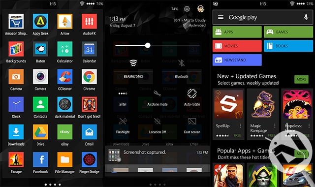
Fed up of the same old white layout skin on Stock Android devices? Well, I hate it too. It’s funny how other manufactures like Samsung and HTC managed to port the same Android version with better color schemes onto their device! Well, Dark Material is a theme which is not going to change the total look of your device, such as the icon and the fonts, but is well-equipped with them if you ever need to do so.
Dark Material is probably what its name says – a blacked version of Android Lollipop. This includes all of the white color scheme now turned into a black one. Personally, this is really cool, especially if you have eye-straining issues like I always do. Ranging from the stock applications like the calculator, and the Google Play Store, to some third party applications like WhatsApp have also been redesigned to suit your needs the best.
What are you waiting for?! Go get this free theme from the Google Play Store right away!
Milos UI
This one has a slightly different color scheme than the previous one we mentioned before. Milos UI not only reduces eye-strain by eliminating the bright white color, but also has an intuitive color scheme, a different one for specific applications. For the very case of the Settings app, the top area is beautifully redesigned, and with a great color scheme of blue and black.
Amongst all three of the themes we’ve mentioned, Milos UI is the one which has a lot to theme around. You even get a specific boot animation with this theme. Some of the major apps redesigned have been listed as follows :
- Settings
- Dialer
- Contacts
- Google Launcher
- Calculator
- Google Play Music
- Google Play Store
- And many more!
Go grab this unique theme for free on the Google Play Store via this link!
That’s been it for our picks of the best CM 12 themes for your Android device. Sure do make sure to let us know which theme out of the there suits you the best! We are keen to know how our growing Android community likes to theme their Android devices! Happy theming!
This article is just the worst.
Please, give us a little detail as to why you think so. Thanks!
its a really subjectiv view how to explain and even chose the 3 TOP CM Themes….reading the headline it implements to get to know about real facts just like public votings or stuff, that would make this order of the top 3 themes valnurable. – dont get me wrong, that a awesome themes…but you just show up 3 “normal” themes, as awesome as even many other ones are aswell, just because of you like them most. – nobody cares about personal descision of a single person if it comes to “best design aspects” …just my opinion.
Feedback is important to us. Whether good or bad. But, can you please elaborate?