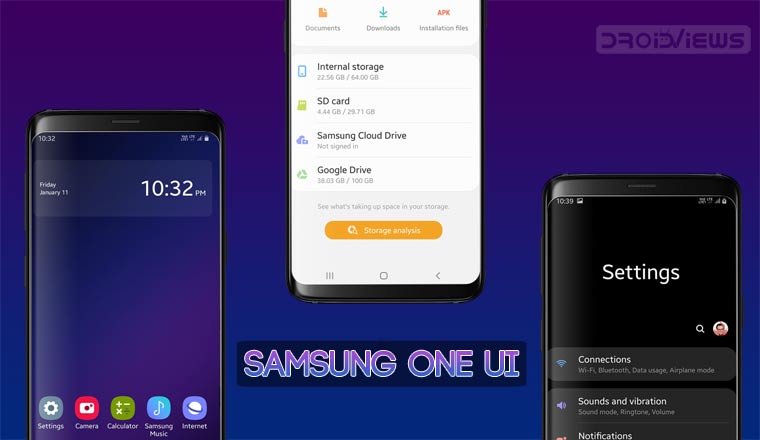
One UI is the new mobile interface developed by Samsung for its Android smartphones. The latest update is already rolling out in few countries, starting from Europe, and currently supports Samsung’s S9, S9+ and Note 9. If you’re interested in the background, below you can find a quick introduction to the One UI Beta Program. After testing it for a few days on our devices, here is the Samsung One UI review in detail!
What is Samsung One UI?
One UI merges everything we already loved in Android Pie with an innovative interface and a lot of features. The new UI will be one of the main selling point of the upcoming Galaxy S10, as well as the foldable Galaxy F. At the same time, the update will also reach some previous flagships, with all the related benefits. The Beta Program serves the purpose of verifying what users like and what don’t. Additionally, it helps Samsung identifying and correcting even the smallest bugs before the final release. Before proceeding, we recommend to take a look at our introduction:
How to Install Samsung One UI?
Samsung has released the One UI update with Android Pie weeks before the original schedule, thus surprising everyone. The roll-out has started from the Exynos Galaxy S9 and S9+, with the Note 9 following closely. Moreover, during the next months, other models will join the list. At the time of writing the article, this update is only available in certain European countries. In order to take a look at the list, you can search for your model in SamFirm tool. Luckily, it’s still possible to safely flash a firmware from a different country without voiding your warranty. If you’re interested, we suggest to check out the manual update tutorial.
Samsung One UI Review
The name One UI refers to one-handed use, which has been the main focal element of the new interface. While this is the first thing you’ll notice, there are many other important changes to know about. We have compiled a list of the most significant changes, so you know what to expect. In addition to that, for those who would like to install it on their own devices, we’ll also provide some information about the technical aspects of the One UI. Keep in mind that we have performed a factory reset after the upgrade, in order to ensure the most accurate results. Now, here is our Samsung One UI review!
What’s New in Samsung One UI?
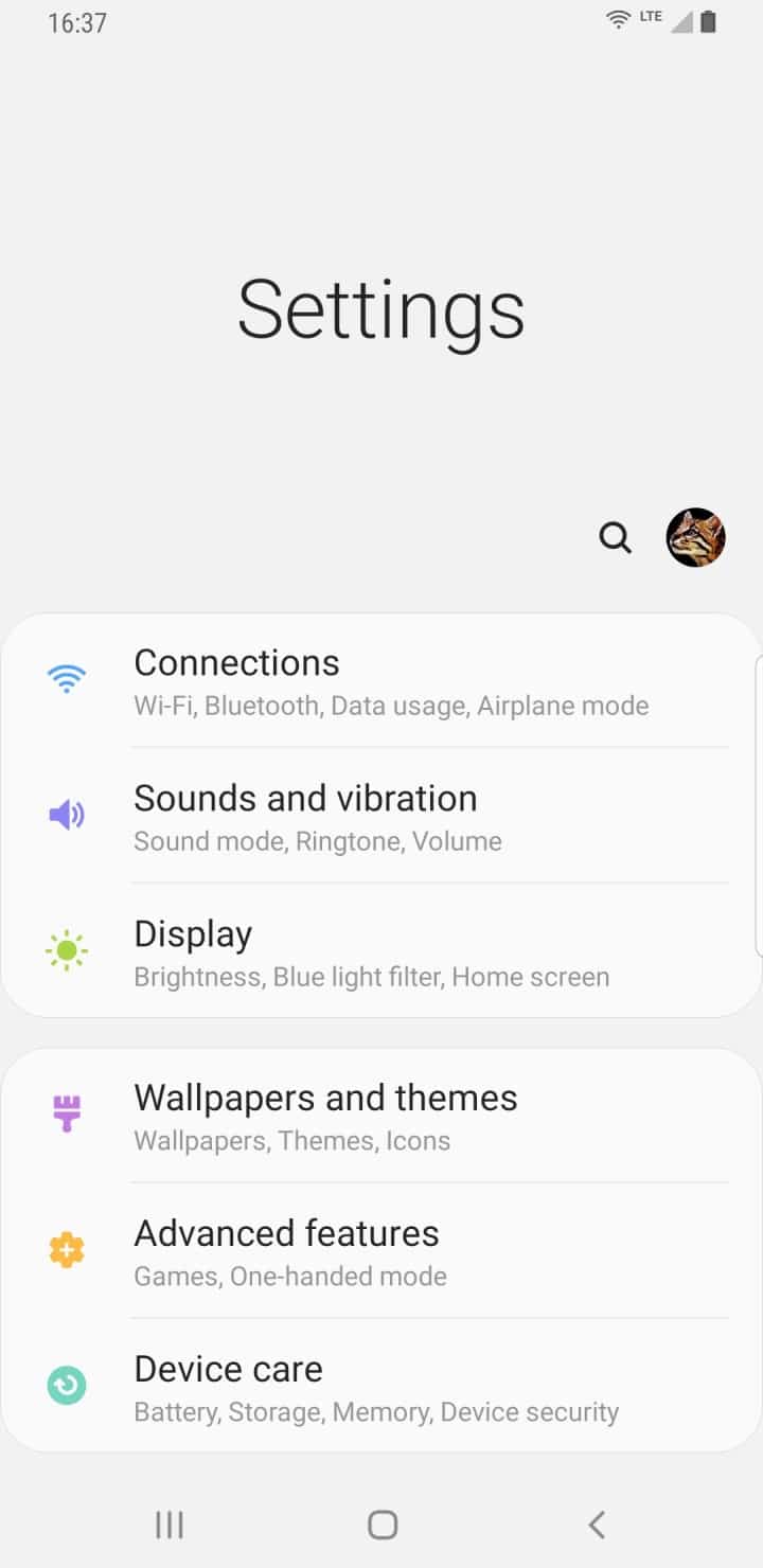
1. New Interface
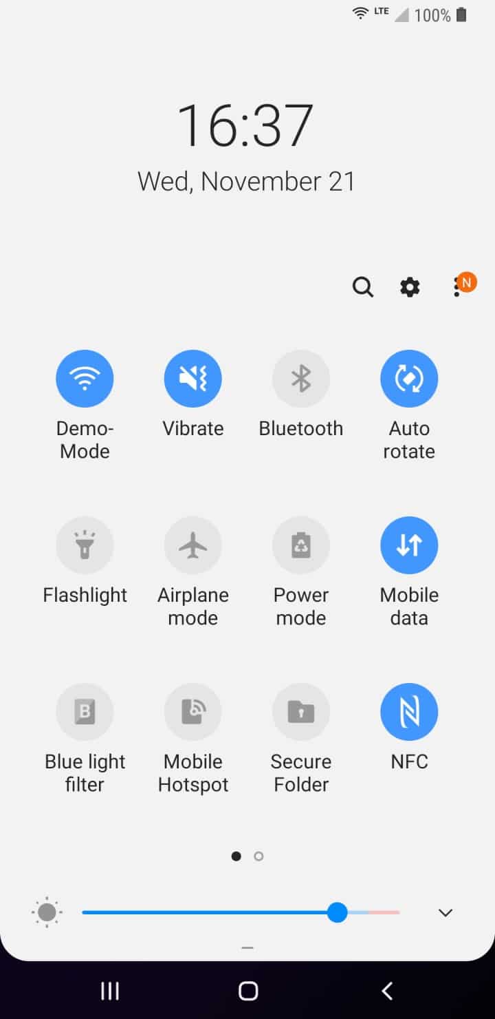
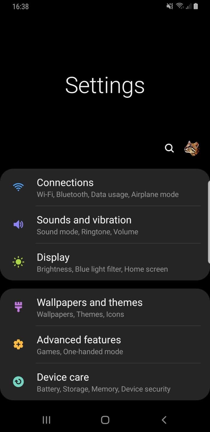
The interface itself is one of the most significant changes in One UI. In order to simplify one-handed use, Samsung has decided to separate the interaction area from the viewing one. As a result, everything you need will be placed on the bottom part of the display, at the reach of your thumb. Moreover, with the goal of simplifying the experience, the important elements will now be highlighted with colored bubbles. Lastly, we can see that the design is closer to the stock version of Android than ever before. However, you’ll still notice a lot of influence from the typical Samsung style, especially with the use of rounded corners.
2. System-wide Night Mode
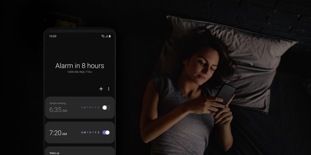
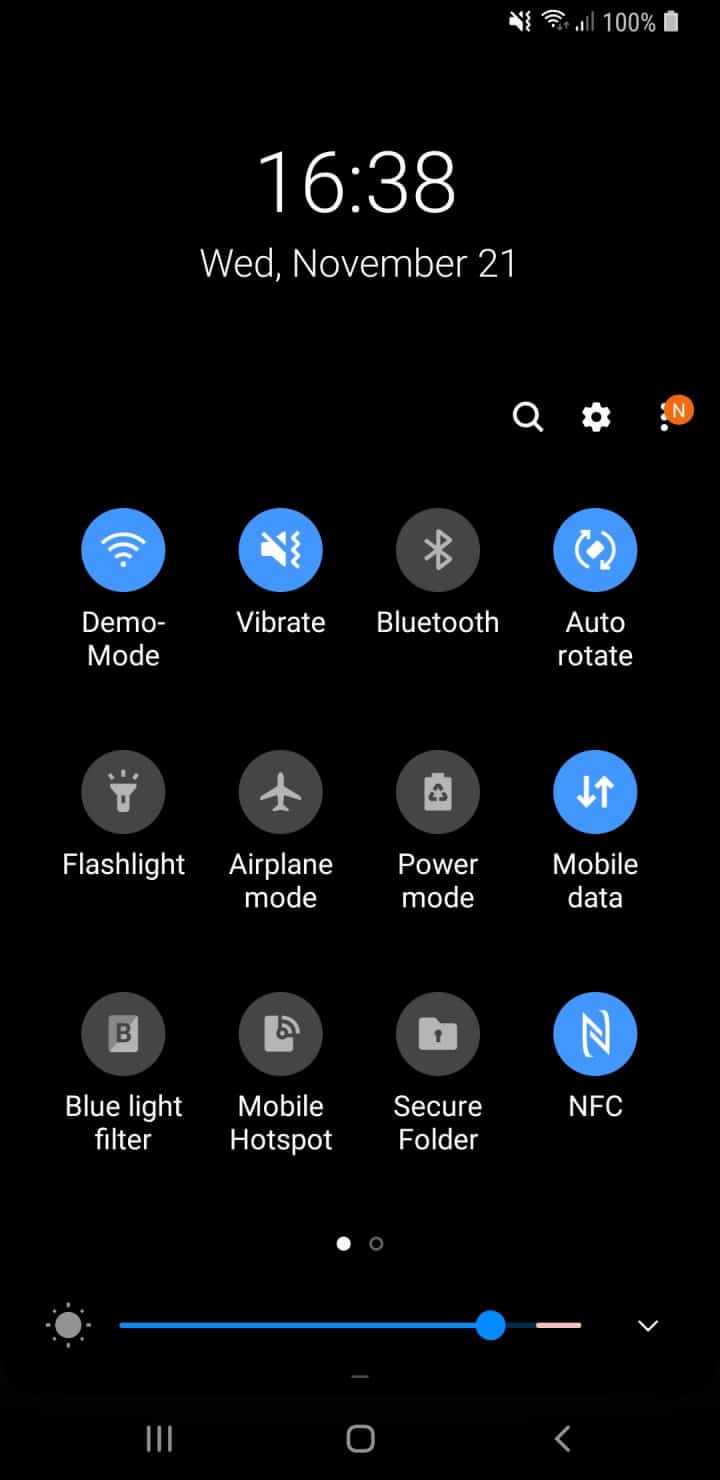
After seeing it in stock Android Pie, the native night mode has now reached Samsung devices. The setting is very easy to toggle, not to mention that you can create an automatic schedule. This is particularly good for those who don’t like the glare of the display at night but would prefer to avoid the yellowish tint caused by the blue light filter. However, it’s also a valuable feature if you simply like dark themes in general. Furthermore, although it’s not something we often think about, it’s important to keep in mind the positive impact on battery life. If you want to learn more about this, you can find all the information you need here:
3. Re-designed Apps
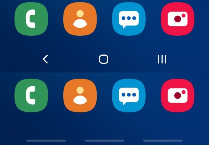
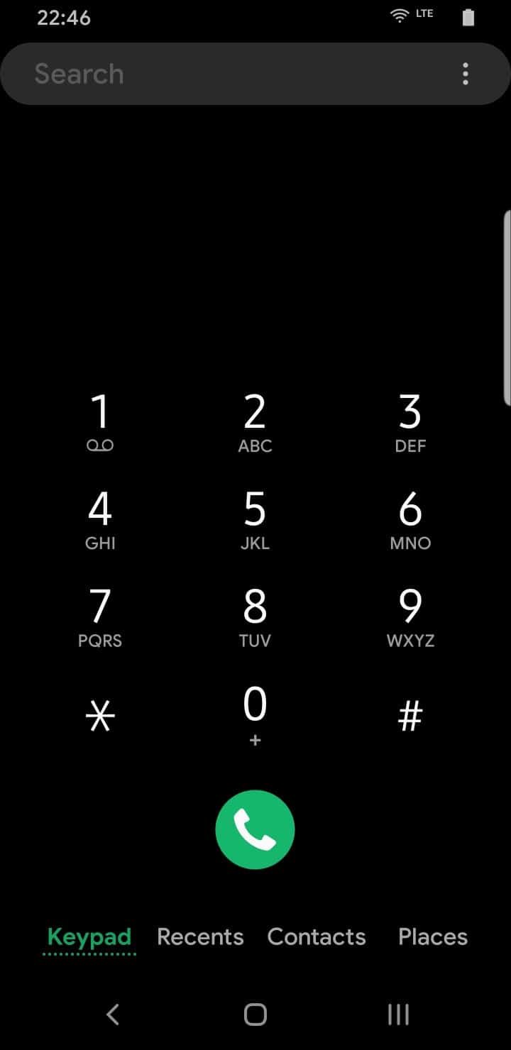
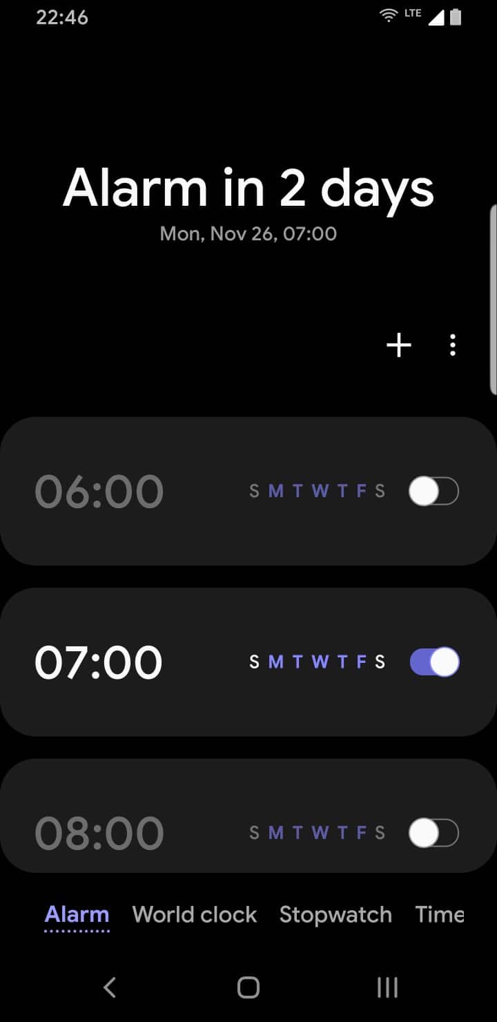
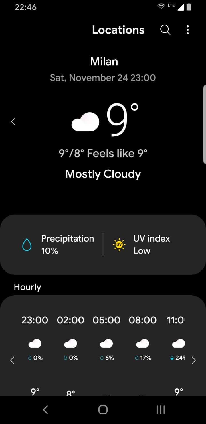
All Samsung apps now follow the same base concept on which One UI has been built. In fact, you’ll see that tabs have been moved to the bottom, so they’re easier to reach. In addition to that, the appearance is much cleaner, helping you focus on what actually matters. As a result, the design language is much more consistent and the experience more enjoyable. Similarly, app icons have also received a new design, even though not everyone appreciates this change. However, the possibility of changing the default icon pack will remain there.
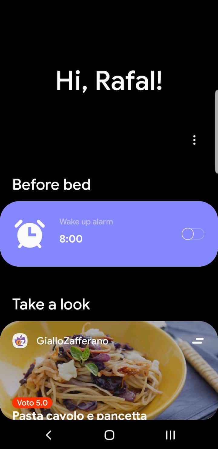
4. Refreshed Home & Bixby
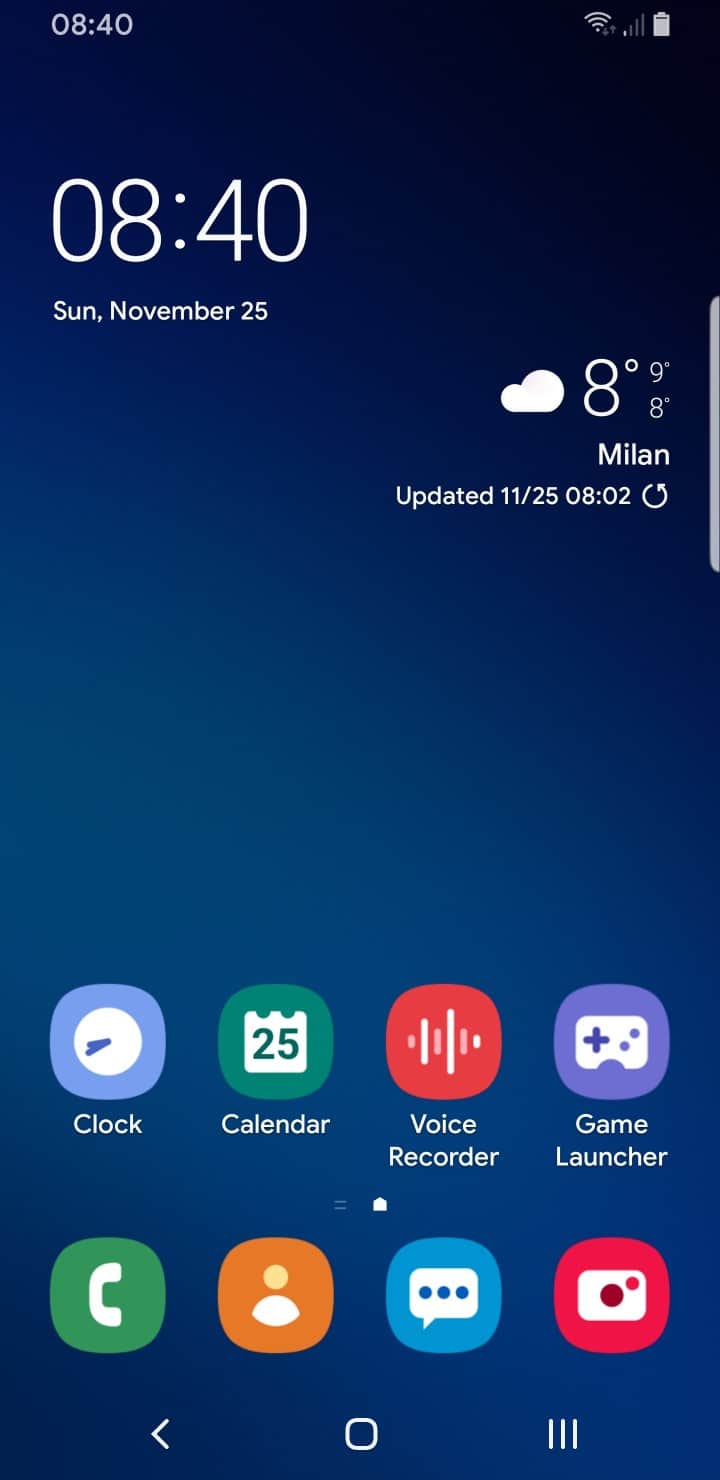
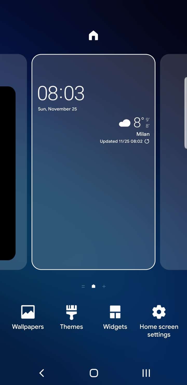
The home launcher follows the lines of the new interface, without getting too far from what we’re used to. Just like before, you can swipe up to access the drawer and down to open the notifications. Moreover, you can still eliminate the drawer and move all your icons to the home screen. While there’s nothing particularly impressive about the home screen, the Bixby feed on the left is completely new. In fact, the transition is extremely smooth and there are no loading times. Additionally, just as you may expect, its looks now perfectly match the rest of the UI. Even though the functionality hasn’t changed a lot, you may find yourself using it more often thanks to the improvements.
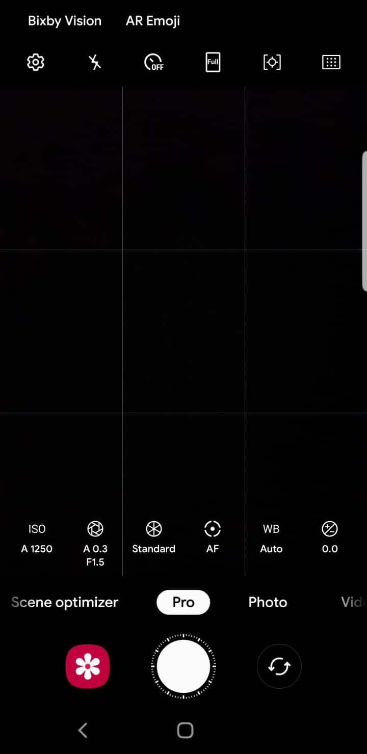
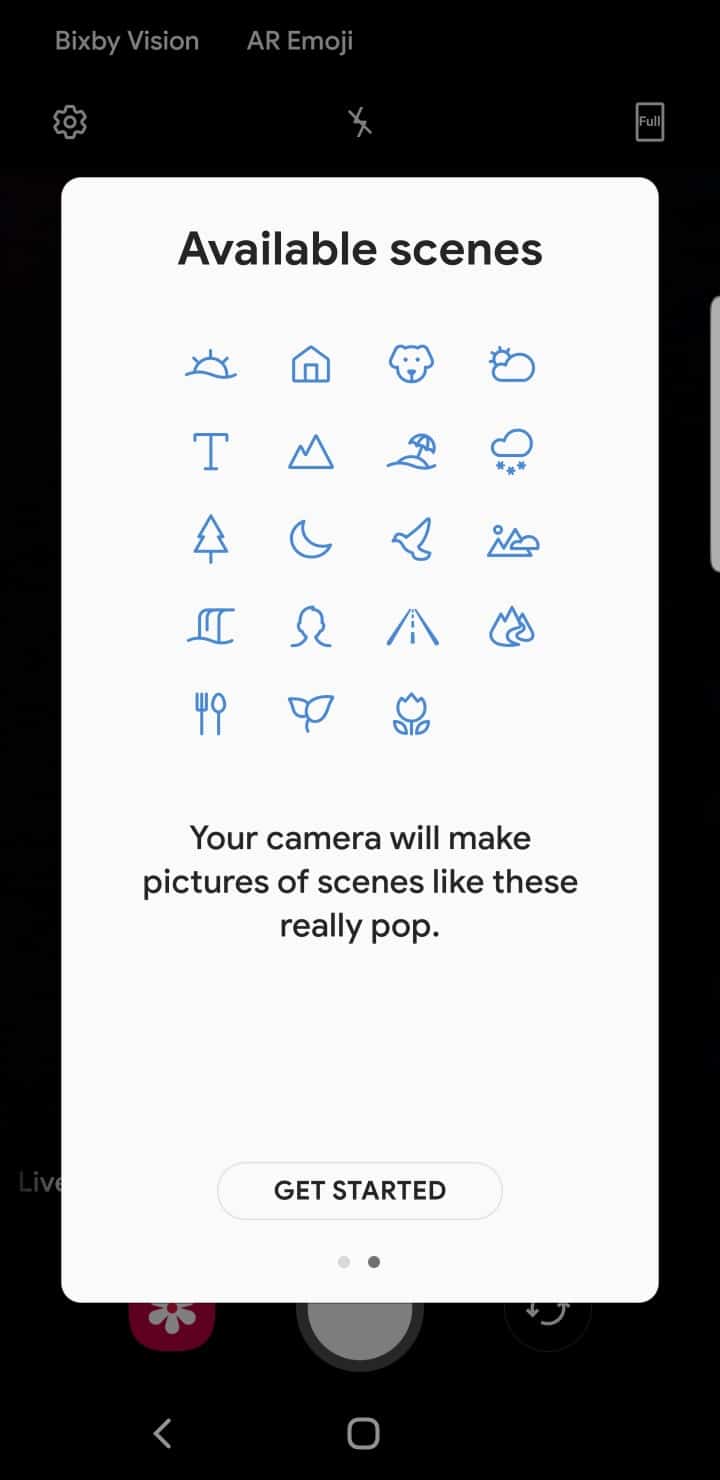
5. Smarter Camera
The changes in the camera compartment will be more significant for S9 users, than Note 9 ones. In fact, the latest Note already gave us a preview of a new feature called Scene Optimizer. This mode allows the device to recognize the subject, and automatically adjust the settings for the best results. The reason why this is great is that you can get better shots without spending the time to manually set up the Pro mode. In a recent update, Samsung has integrated this feature in the Auto Mode, so it’s even quicker to access. In addition to that, you also get flaw detection, which notifies you when your last shot appears blurry or there are other issues such as subjects closed eyes.
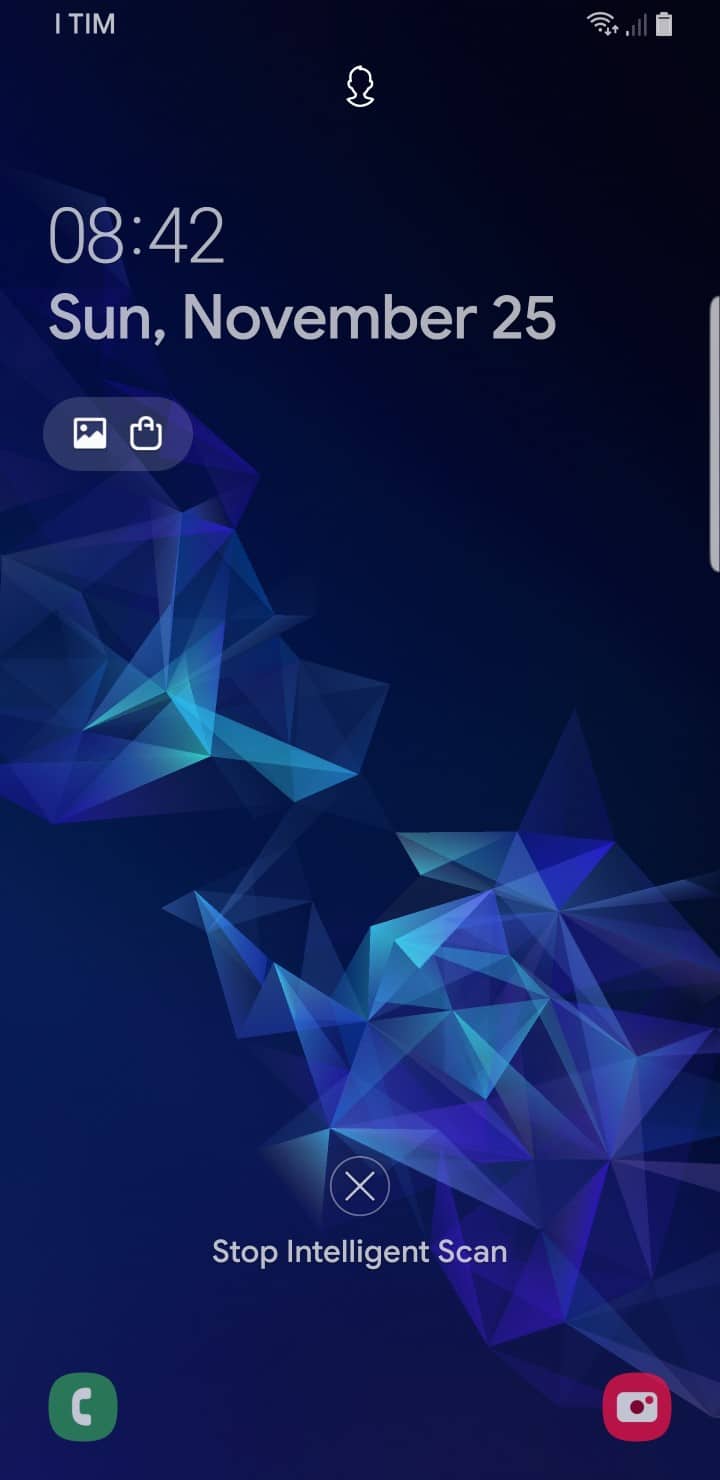
6. Always On Display
The Always On Display is a feature we all love thanks to its practicality. Since most of the display stays off and the brightness is low, the impact on your battery is fairly low. However, you may not know that it still uses on average 1 to 2% of your energy every hour. In order to improve this aspect, Samsung has introduced a new behavior. In fact, by default, the display will remain off until you tap it. Doing so will activate the AOD for 30 seconds, thus giving you the time to check everything. Additionally, they have also introduced Lift to Wake, which does exactly what the name suggests.
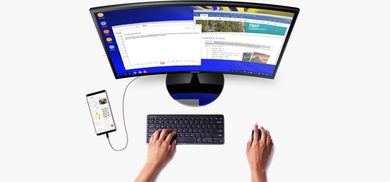
7. Dockless DeX
Another feature coming straight from the Galaxy Note 9 is Dockless DeX. For those who don’t know, DeX stands for Desktop Experience, and allows you to use your smartphone as a PC. Before the Note 9, using this feature required a special docking station. Now, the dockless mode enables you to use DeX with a simple USB-C to HDMI adapter. Needless to say, this solution is much more convenient for casual use, plus the adapter is significantly cheaper. However, you still need to keep in mind that the number of running apps will be limited to 5, while the docking stations allow up to 20.
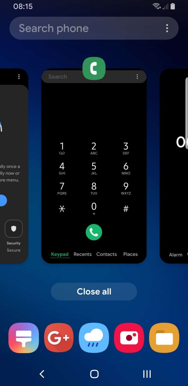
8. Navigation Gestures
Android Pie has introduced a new way of interacting with our devices, which merges with the refreshed multitasking menu. In fact, you can now combine taps and swipes to easily switch between apps. Samsung didn’t like this concept, as the navigation bar was still there taking up extra space. The way they have implemented this idea is by simply replacing taps with swipes. As a result, the navigation bar works just like usual, but you need to swipe up from the bottom to operate the keys. If you want, you can completely disable visual hints, so you’ll have more free screen real estate. In case you don’t like this, you can keep using the regular navigation buttons just like in Oreo.
Samsung One UI Experience
1. Stability
One UI has been in development for a while, and the usability of the firmware has been excellent since the first public beta. We have been using the new OS for a few days and we have tested nearly 200 apps. Until now, we haven’t experienced accidental force closes or random restarts. While we cannot guarantee that it will work equally well for everyone, the premises are very promising. Moreover, the January security patch is already rolling out with some further improvements, so make sure to update when you receive the notification!
2. Performance
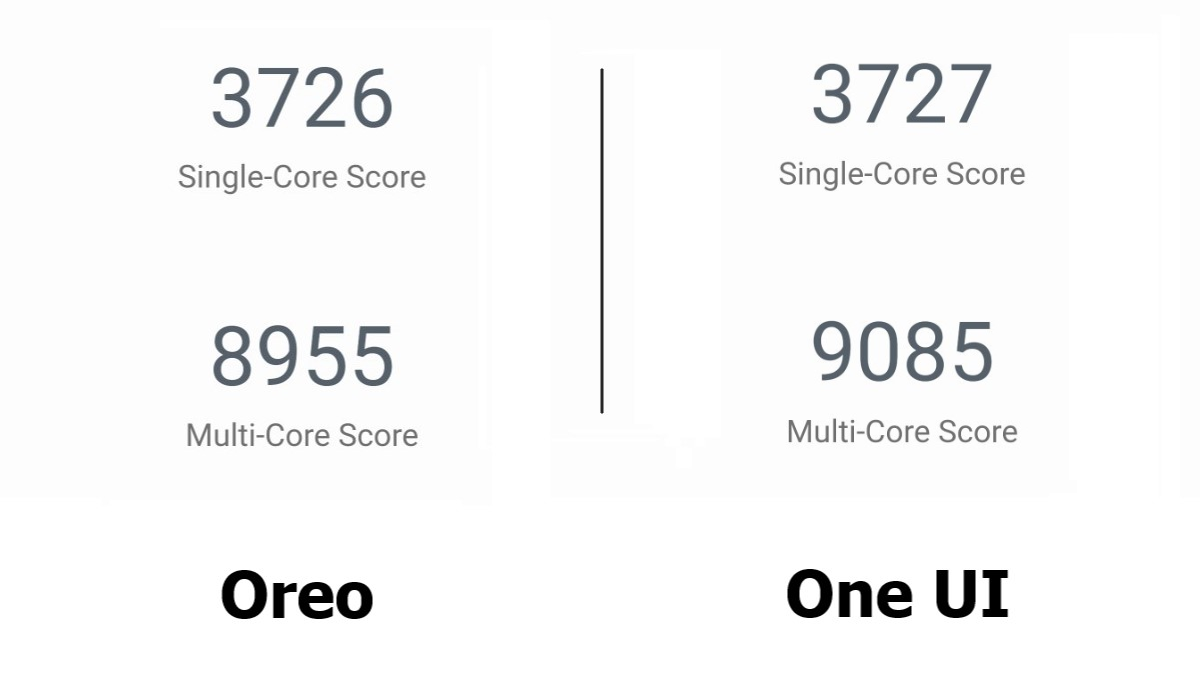
The overall performance of One UI has been comparable to Oreo. One of the main advantages of the new interface is the new, faster animations. Because of this, the device always feels fast and responsive. We have run Geekbench 4 for some accurate information about the processor. The result is predictably similar between the two Android versions, which suggests that we can expect similar performance and battery balance. In case you’re curious, we’ll leave both Geekbench scores below. The tested model is an SM-G965F with the Exynos SoC.
3. Battery Life
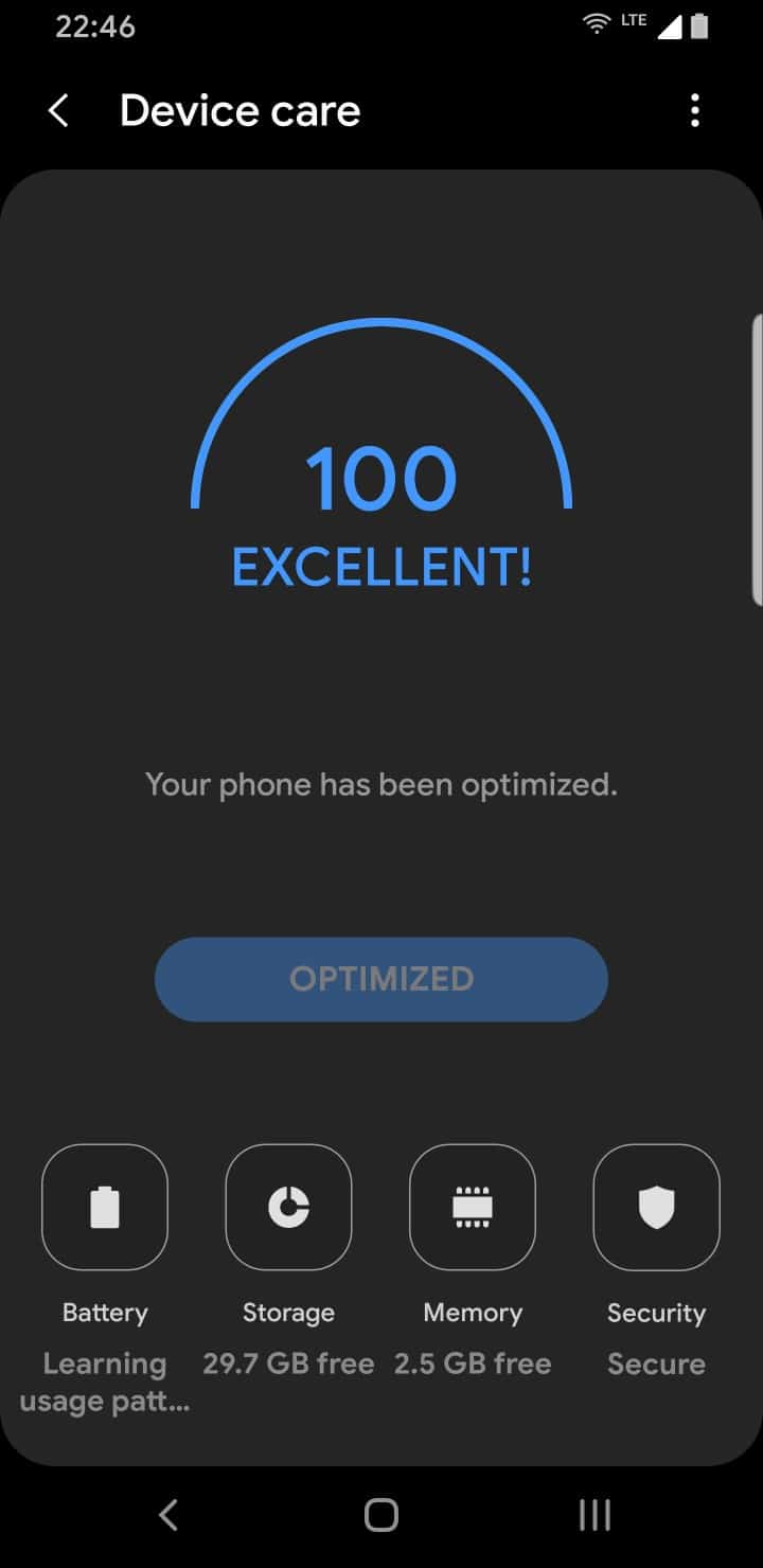
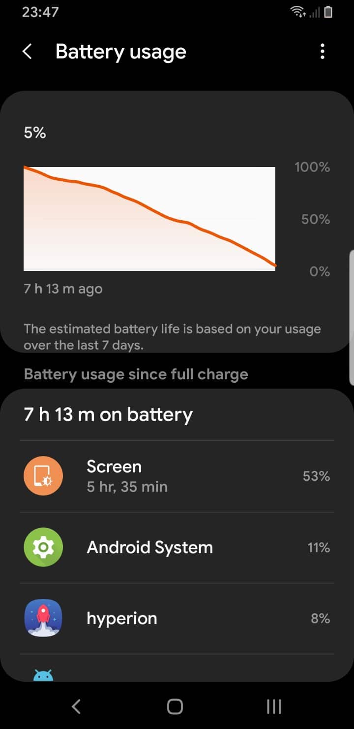
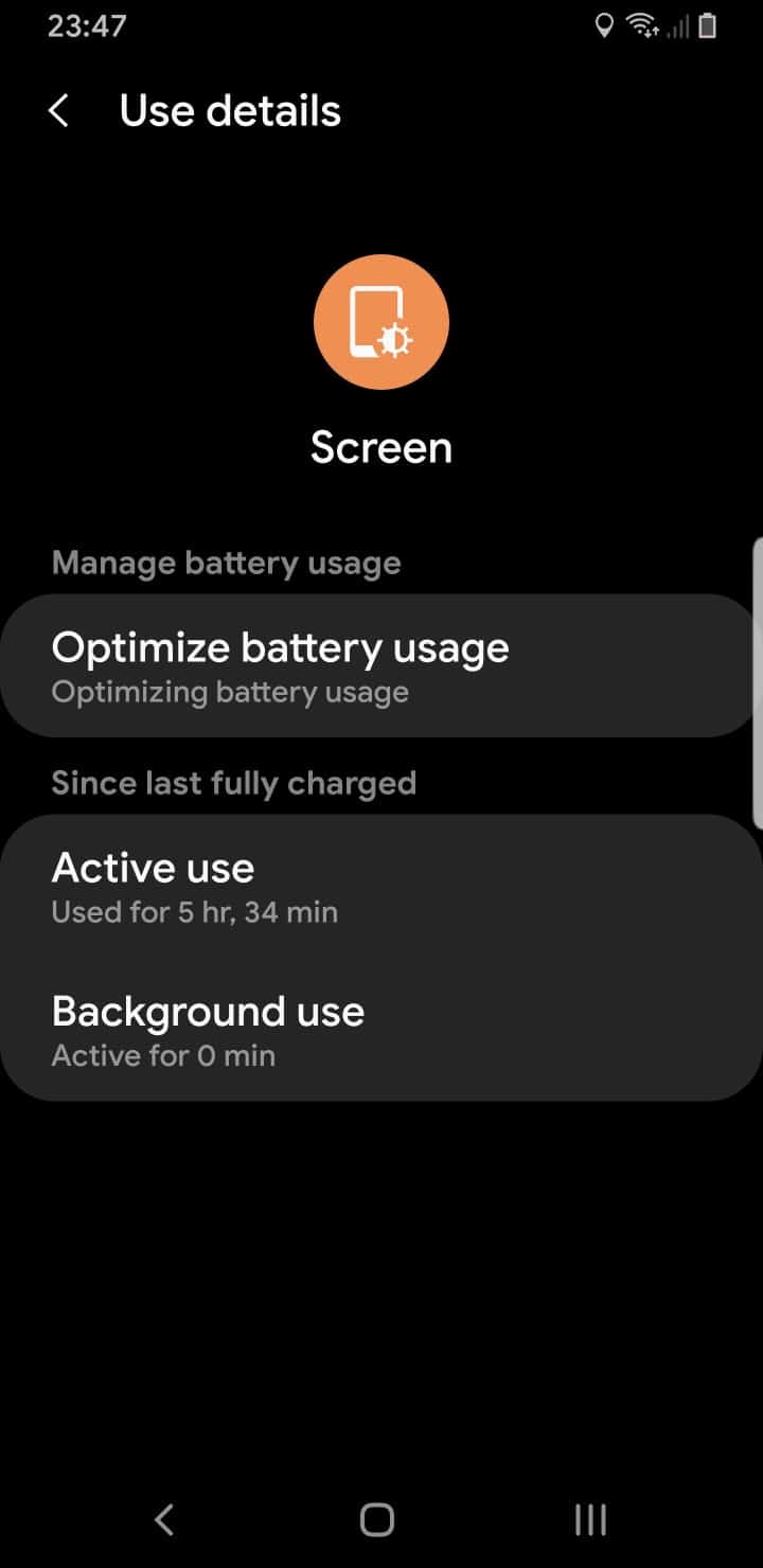
Battery life can be very unstable during the first days because restoring backups and installing apps requires more power. Moreover, the system generally takes at least one week to learn the usage patterns. When this process is complete, the device puts less frequently used apps to sleep, thus saving a lot of battery. Samsung has also introduced the new Adaptive Battery feature, which learns usage patterns to help saving power. Since this feature requires some time to become effective, it’s still too early to see the results. We’ll leave a screenshot of the review day data, so you can get an idea. This is also the best result we’ve got, compared to the previous days. The device has been used with manual brightness (90%) and Wi-Fi only.
Now here we wind up our Samsung One UI review. Let us know in the comments if you have tried One UI on your device!


Join The Discussion: