The last few weeks have been busy at Facebook, not that the other days aren’t. But the last few weeks must have been especially busy. Facebook has been rolling out a crucial update to one of its most successful products, the Facebook Messenger. The app has over 1 billion active users and has been a stark contrast to another, similar, Facebook-owned app, WhatsApp. Where WhatsApp is known for its simplicity, Messenger has been a bloated mess for the past few years. So much so that the company had to release a lite version. The social networking giant announced this update near the end of October 2018. Finally, Facebook Messenger 4 is coming to your devices with a global rollout.
Simple
Even though Facebook owns WhatsApp, it took the company a survey to find out that people preferred simpler design over unwanted features in a messaging app. I’ve previously talked about just how bloated the Messenger app from Facebook has been. Games, News, Music, Bots, and all other kinds of crap was put into this messaging app which was meant to simply send messages. All those features nobody asked for were fighting for attention in the app’s main page along with chat threads.
Then Facebook got the Snapchat fever and introduced stories into the mix as well. That wasn’t enough, so they brought it to the center stage as well. At one point, I even wanted to give credit to the people who made the app for cramming in so much into a messaging app that it was almost choking.
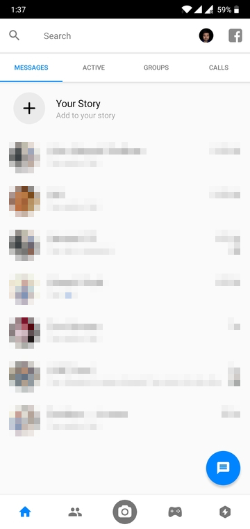
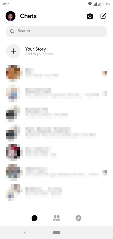
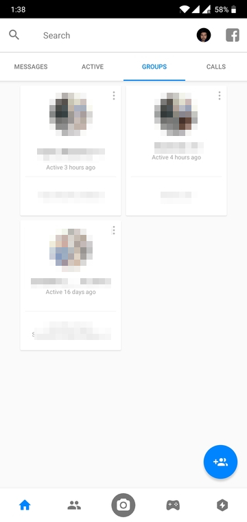
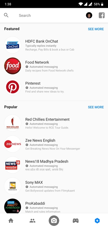
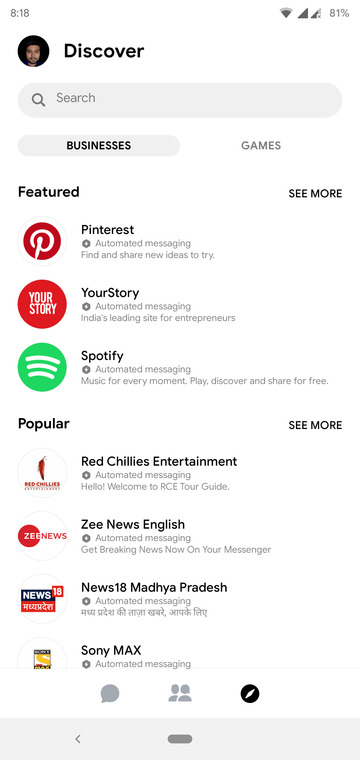
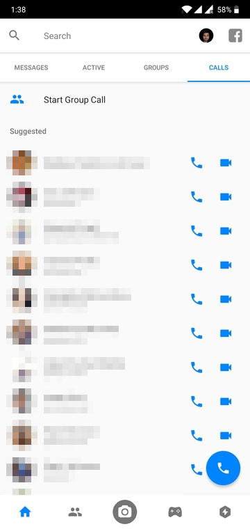
Most people with better things to do in life probably never counted, but this single app had a total of eight tabs, a camera shortcut, a shortcut to the Facebook app and a shortcut to the settings page all on one screen. Of course, all your chats as well. Just look at it above, compared to the newer redesign. The tabs are all but gone at the top and also missing is the games tab at the bottom.
Modern
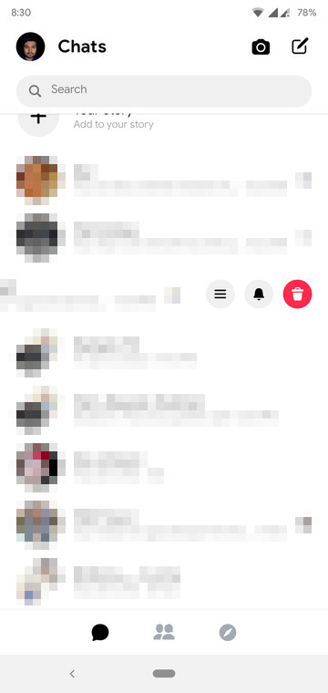
So it’s simpler but simple can suck sometimes, but not this time. Messenger 4 not only looks simpler but its also more modern with a more pronounced use of material design and new fonts and icons. Not only that, but it also makes better use of gestures. Swiping to the right on a chat now reveals options to mute or delete the conversation and a menu button. This menu can also be accessed with a simple long press. A swipe to the left brings up options to directly send a picture from your camera, make a voice or a video call. As I said before, simpler with more focus on chats, not bots.
Oh and the useless GROUPS tab, no more. Creating a group is as easy as creating a new message and adding multiple recipients.
Must read: 4 Best Free Photo Management Apps for Android
Fully functional
Going the minimalist way requires shredding some load off but Facebook has managed to not do that. Of course, the app isn’t quite something one would call minimalist but it has come a long way from the bloated mess it was. All the features that lived on the main page have now neatly been tucked away into nicer places where they won’t bother anyone who doesn’t want to be bothered about them. Games and the bots have all been stuffed into a single Discover tab.
There are many similar changes to the app and while you may not find these functions right on the main screen, they are definitely there. I’ve checked. While it may sound like the app has become more confusing now, it hasn’t, in fact. I can imagine some users would be confused with the new design, which should have been there from the start.
Getting used to the Facebook Messenger 4 won’t take very long though because everything now makes sense. You don’t need a separate tab just to create and manage groups so it’s gone. Want to chat? Well, head to the People’s tab and you can see who’s online. All the suggestions about people you should call and the list of people you’ve contacted are packed inside the People’s tab at the top.
So yeah, fully functional. What do you think of the new design? Sound off in the comments below.
Read next: 10 Facebook Messenger Tips and Tricks You Must Check Out



Join The Discussion: