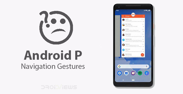
Android P Developer Preview 5 (Beta 4) has been out for some time now. This is the last developer preview which means everything that is present here will almost definitely make it to the stable Android P release. We’ve mentioned some of its major features in an earlier post. One of the many changes it brings is a complete overhaul of the way we navigate our way through the Android OS. It is fortunately still optional to enable the new gesture navigation, and it is not turned on by default. It is still something definitely worth trying out though when and if your device does get updated to Android P.
Everyone has been using words like intuitive to describe the new gesture navigation and that’s because on some levels it is. On others, not so much but we’ll get to that later. So instead of three different buttons, the new navigation bar has just one, pill-shaped button and a back button that only appears when needed. And that would be all the time really except when you’re on the home screen. Since there is no more a recents button, things can be slightly confusing in you don’t know how to get things done.
Using Android P Navigation Gestures
Home button
There’s no home button, at least in the traditional sense but the new navigation pill is still that. Because it is a button that you can tap to go home so yeah, I’d still call it a home button, as in a button to go to the home screen. Not only that, you can also long press on it to access Google Assistant which is again what you’d expect the home button to do. Of course, it is not only a home button anymore.
Switching apps & Multi-tasking
There’s no recents button anymore. To get to the multitasking view, you have to swipe up once from the bottom of the screen. The swipe does not necessarily have to be on the pill button. The new multitasking view, or overview as it is now called, presents you with a horizontally scrolling list of cards unlike the vertically scrolling cards before.
You have the Google search bar below this and few apps that Android thinks you might want to use. To get to the split screen, you now have to tap and hold on the app icon at the top of an app card. You get options such as App info and Split screen here. This is how you can do this on the Google Pixel and other stock Android devices at least. Other OEMs might want to fiddle with that as OnePlus already does and hides these options behind a three-dot overflow menu instead.
Similarly, the Google search bar and the app suggestions aren’t there on OnePlus’ implementation of Android P. It’s fair to assume they might not make it to other OEM devices as well. The best part about this new navigation system is the swipe right gesture. You can hold and drag the pill button to the right to quickly switch between your last five or six apps without even having to go to the multitasking view. A simple flick of the pill button to the right quickly switches between your previous and current apps.
Don’t miss: NavBar Animations Adds Beautiful Animations to Your Navigation Bar
App Drawer
Swiping up again from the bottom of the screen in multitasking view will take you to the app drawer. So it is basically two swipes to get to the app drawer and one for the overview. Alternatively, you can perform a long swipe from the bottom to access the app drawer directly. Once again, this is how it works on the Pixel, but it might not work on other devices.
Go back
 So as already mentioned, your beloved back button is still there. Anytime you want to go back just tap on it. The only place it won’t be visible is the home screen because how further back could you possibly go from there.
Missed opportunity
Hate Apple all you want but one has to agree that even if they copy things they copy it right. Everyone’s quite happy with the gesture navigation on iOS and while critics may say they copied it from Palm OS, well, at least they copied it right. They got rid of the home button, managed to keep its functionality, and did not sacrifice any screen real estate in the process. Yes the iPhone X had that notch but so do many Android devices. Yet, most of them have failed to copy it right. They have the notch and a bottom chin, every single of them, some small some big.
Android P’s implementation of gestures kind of feels the same way. You still have buttons and thus the navigation bar and therefore no real gain in screen real estate.
Mixed Signals
We can forget that for a moment since Google never said getting rid of the navigation bar was a goal. But what is Google trying here? A switch to gestures or a mix of gestures and buttons that might end up confusing users even more. Google is giving some mixed signals here. Keep in mind when I say users, I’m also thinking about all those people who aren’t as technical as you or me such as our parents or grandparents or even many younger people.
By the way, why is the back button still there? The pill can move up, left, or right. The navigation has been designed so that you can swipe up for the overview, right for quickly switching between apps but there’s nothing for swiping left. Swiping left to go back makes perfect sense and is so obvious but instead, there’s a back button. Swiping to the left does absolutely nothing. Moreover, the back button leaves us with an oddly lopsided series of icons. Sure it’s not visible on the home screen but it is visible everywhere else, even in the app drawer.
Related article: Get Swipe to Go Home Gesture from iPhone X on Any Android
I still love it… some of it
I can live with a navigation bar, I don’t even mind the mixed signals because at least for now all of that is optional. Users will have to go out of there way to even enable the gesture navigation from the Settings. But here’s the thing, I do very much love the gesture navigation and I want to use it. Mostly the swipe right to switch between apps. It is so neat, quick, and natural. My only actual, personal gripe with it is the back button which is just the opposite of how things feel on the right side of the pill button. That and why does the nav bar still need so much space? Shrink it at least, Google.
Maybe I’m missing something here that the engineers at Google aren’t or maybe not. What do you think about Android P’s gesture navigation? Have you tried it yet?
You may also like: Navigation Gestures on Android 5.0+ Without Root


Join The Discussion: